tl;dr
- Material Icons and Cupertino Icons are sufficient for basic use cases
- If you don’t find the icon you are looking for, you can extend your search by third party icon packages like Fontawesome
- If even this is not enough, you can create your custom font yourself
- Icomoon lets you define your own icon package that can consist of both third party icons and your own SVGs
- If you upload your own SVG files, you have to strip down everything to a single path with a single color
Have you ever found yourself in the situation of wanting to use an icon when you were implementing a Flutter app but none of the MaterialIcons and CupertinoIcons contained the symbol you wanted?
Good news: You are not limited to these natively provided icon packages. Instead, you can choose from a variety of community packages and even create your own.
Using Material Icons and Cupertino Icons
Before we deep-dive into the process of creating your own icon package, let’s have a look at the classic way of using icons: with MaterialIcons and CupertinoIcons
Material Icons
In your pubspec.yml file, there is a property that is true by default. It’s called uses-material-design and is located directly under the (root) flutter key of the file:
1flutter:
2  # The following line ensures that the Material Icons font is
3  # included with your application, so that you can use the icons in
4  # the material Icons class.
5  uses-material-design: true
Having generated a new project, the default comment event states the purpose of this property. It bundles the Material Icons font with your app.
You are now able to use the icons by importing the material package like this:
1import 'package:flutter/material.dart';
and using the icon like this:

FloatingActionButtonYou might ask yourself what happens if we set uses-material-design to false and use the icons anyways.
Since font loading happens dynamically at runtime, there is no issue during the build. However, the icons behave strangely:

The question marks were expected but the beer 🍺 is a refreshing surprise. It seems like the UTF 16 HEX code of the beer emoji overlaps with the add sign in the material icon font.
Cupertino Icons
The Cupertino Icons, which represent the icons which are in use in the iOS world, are actually a separate package being hosted on pub.dev.
To include it in your project, you have to treat it like a usual package by adding it to your pubspec.yaml:
1dependencies:
2  # The following adds the Cupertino Icons font to your application.
3  # Use with the CupertinoIcons class for iOS style icons.
4  cupertino_icons: ^1.0.2
The wrapper that provides the CupertinoIcons class will be there even if you omit the package dependency.
However, if you use the icons like this without the dependency in the pubspec.yaml:
1import 'package:flutter/cupertino.dart';
2
3…
4
5return FloatingActionButton(
6  child: const CupertinoIcons(Icons.add)
7);
you end up with the same question marks you have seen above (no beer this time, though).
Using icon packages like Fontawesome
Whether you choose a shipped icon package or a third party package, the principles are always similar: A class with static members wraps the access to the different icons.
The return value is of type IconData which you can insert into an Icon widget.
Some packages like Fontawesome treat it a little bit differently: the icons are still of type IconData, but Icon is not supposed to be used as the rendering widget. Instead, you have to used the custom FaIcon widget.
The reason is that the native Icon class assumes all icons to be square:
 1return Semantics(
 2  label: semanticLabel,
 3  child: ExcludeSemantics(
 4    child: SizedBox(
 5      width: iconSize,
 6      height: iconSize,
 7      child: Center(
 8        child: iconWidget,
 9      ),
10    ),
11  ),
12);
This is not the case for the Fontawesome icons. The authors of the package solved it by removing the SizedBox widget:
Using custom icons
The use of existing icons might be a good solution for the average, smaller project. However, if you have a more complex app, that requires proper branding, this solution may not be specific enough.
Instead, you’ll want to choose your own custom icons (possibly in combination with existing icons).
What you have to do in this case is to make a font (e. g. ttf file) from your icons. It’s also required to write a wrapper class just like the MaterialIcons, CupertinoIcons or Fontawesome classes that wraps the access to the characters of your icon font.
Luckily, you don’t have to do this by hand. As long as you have the icons available as a vector file (e. g. svg file), you can very quickly create your font.
Icomoon
Icomoon started as a custom font packaging solution for the web. As of today, it also offers an export to Flutter. The idea is that you have a web UI in which you can choose the icons you want to have in your icon package. You can choose from free or paid icons and also upload your own. Once you are satisfied with your selection, you can export the package as a font.
Let’s start by creating a font that contains the logo of this website. For this, we use the SVG file representing the logo:
We initiate the process by loading https://icomoon.io/app and just dragging and dropping the file onto the single page application.
The first thing we’re presented with is this:

We will ignore this for now.
We can see the logo we have just uploaded.

We proceed by clicking “Generate Font” on the bottom right.
The application warns us once again about strokes in the file:
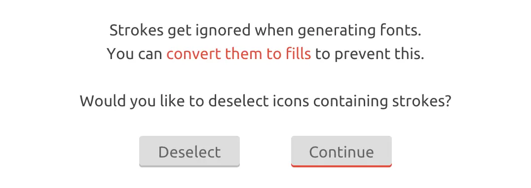
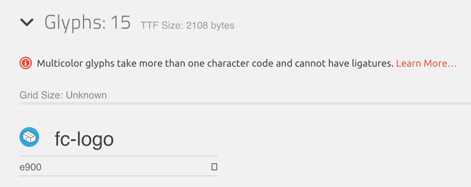
And this is not the only warning we’re presented with. On top of the overview of which glyphs are being exported, it says the following:
Before we continue actually downloading, we make sure that we have checked the option to export the dart file:
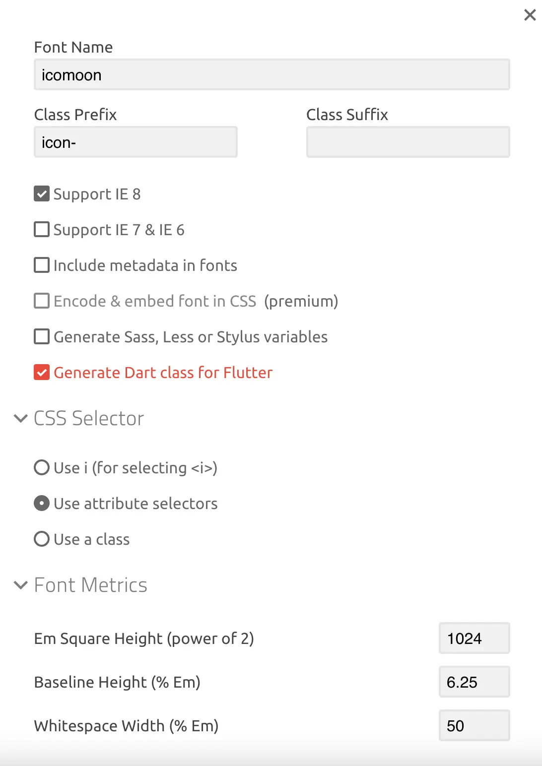
Otherwise, we would only get the CSS files and the font files.
In spite of the warning, we download the package by clicking the download button.
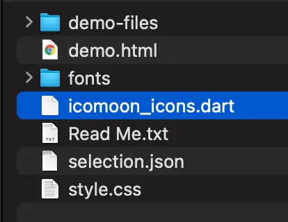
Then we move the fonts folder into a newly created assets directory within our project.
The icomoon_icons.dart is also moved into the project directory by us.
To make Flutter recognize the fonts, we need to add them to the pubspec.yaml file:
Now we start the app containing a widget that centers our Icon:
Instead of the icon, we see something different:

This is related to the warnings that Icomoon has displayed. We are trying to create a single glyph here. What we’re providing is a multi-layered SVG file with paths.
In order to transform it into a SVG file that is usable as a glyph we need to:
- Dissolve all groups (Shift + Command + G in Inkscape or
Object > Ungroup) - Convert all strokes to paths (
Path > Stroke to Pathin Inkscape) - Make all paths a common path (
Path > Unionin Inkscape)
After these actions, it should look like this:
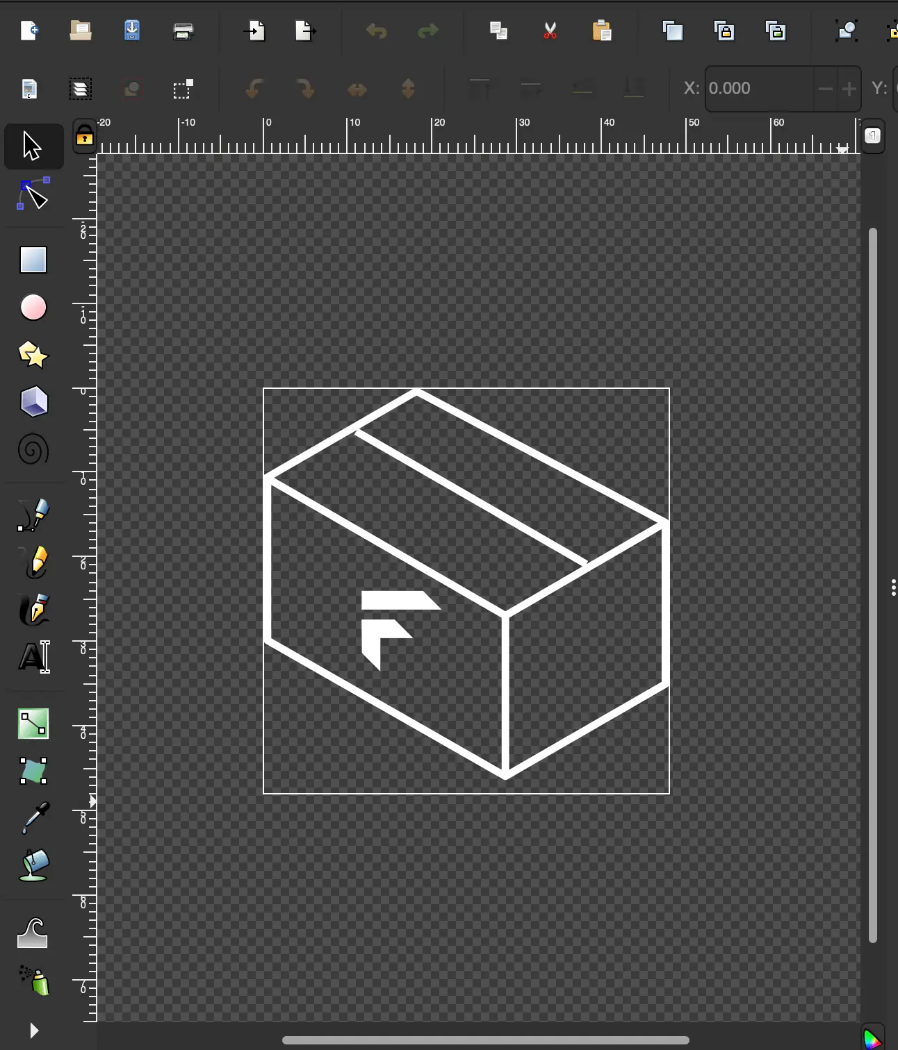
Having re-uploaded the icons to Icomoon, we should see a screen similar to this:

Usage as an icon
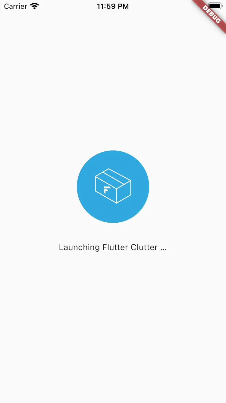
If we include the icon in our app now, the rendering works as intended:
Usage as part of a text
An alternative to displaying it as an Icon is to embed it into text. For this, we need the correct character code.
For this purpose, we can either have a look into the Icomoon web UI or the icomoon_icons.dart file:
1import 'package:flutter/widgets.dart';
2
3class Icomoon {
4  Icomoon._();
5
6  static const String _fontFamily = 'icomoon';
7
8  static const IconData fc_logo = IconData(0xe900, fontFamily: _fontFamily);
9}
The hex code for our icon is 0xe900. By knowing this, we can let the icon be part of the text.
 1class TextWithIcon extends StatelessWidget {
 2  @override
 3  Widget build(BuildContext context) {
 4    return Text(
 5      'Wow, I can use \ue900 in a sentence!',
 6      textAlign: TextAlign.center,
 7      style: TextStyle(
 8        fontFamily: 'Icomoon',
 9        fontSize: 24,
10      ),
11    );
12  }
13}
We are making use of the Unicode Escape Sequence in order to reference the HEX code of the icon.
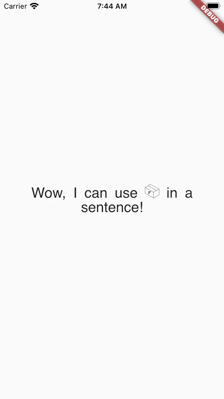
Text widgetThis is as easy as using it as an icon, isn’t it?
Be aware, though, that if you remove and add icons, it can be possible that the char code changes. You will not notice it, because it’s inside the string and the fallback is showing nothing.
What you will notice, though, is when you have used it inside an Icon and the class property is suddenly missing. Because Dart is a compiled language, you won’t be able to build the app if you reference a class property that does not exist anymore.
Multicolor icons
What if you wanted to have icons with more than one color? Like the Flutter Clutter logo has black, grayish and blueish colors. Would that be possible?
To make it short: it is possible, but it’s disproportionately complex. The reason for this is that a multi color icon consists of multiple glyphs. A glyph does not contain any information about its color.
If you wanted to render a multi color icon only using a font, you would have to stack the glyphs on top of each other with a RichText widget containing TextSpans that all have different colors you have defined elsewhere.
At this point, you’re probably better off using a usual SVG renderer lib or convert your icon to a lossless raster image format like png and use the Image widget.
Keeping track of the changes
What if you want to come back at a later point and add or remove an icon from you font?
No problem: You might have noticed the selection.json file that was inside of the .zip file you have downloaded.
This file contains information about the composition of your font: which icon comes from which package and which icon was uploaded by you.
This enables you to import this back into Icomoon at any given time, change something and download it again.
In order to import an existing project, you need to click the burger icon on the top left and choose “Manage Projects”.
There you click “Import Project”. Now you have the project inside the overview and can load it.
Fluttericon.com
Of course, Icomoon is not the only service that can generate fonts from your SVG files. Icomoon is not specifically designed for Flutter. Instead, it was initially only working for the web. Nowadays, you can export the icons for Flutter as well.
There are also providers who have specialized for Flutter. That is, they don’t let you export the CSS file, but only generate the dart class and the font.
An example is fluttericon.com:
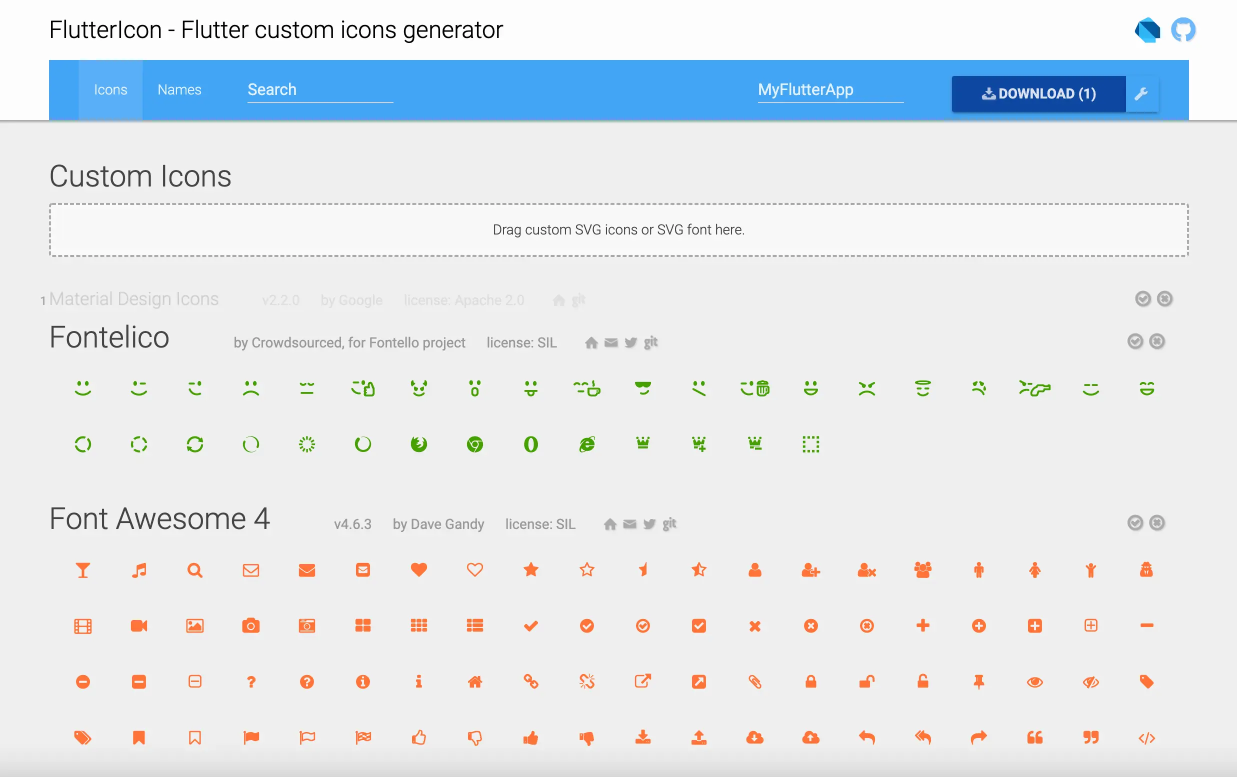
The interface is very similar to Icomoon: a big searchbar for the icons, a grid for the provided icon packages.
In the end it doesn’t really matter, which service you use. They basically only wrap your package with a very thin layer.
However, if you intend to use the same icons across the app and a web project, then I would always recommend Icomoon.
Why it works
An interesting question that comes up is: What is the magic stuff that happens inside an Icon widget that it can just take this IconData and display an icon from it.
In fact, IconData bascially contains information about “what character” and “in which font”. You can see this by looking at the Icomoon class:
icomoon_icons.dart:
1class Icomoon {
2  Icomoon._();
3
4  static const String _fontFamily = 'icomoon';
5
6  static const IconData fc_logo = IconData(0xe900, fontFamily: _fontFamily);
7}
The Icon widget on the other hand just takes this font information and puts it into a text widget (TextSpan). The icon size becomes the font size and the font family is also just forwarded. And of course the text itself is just the character code taken from the IconData.
That means that in the end, an Icon widget is nothing more that a text widget with a well defined input.
We can observe this closer by looking at icon.dart in the flutter package:
 1TextSpan(
 2  text: String.fromCharCode(icon!.codePoint),
 3  style: TextStyle(
 4    inherit: false,
 5    color: iconColor,
 6    fontSize: iconSize,
 7    fontFamily: icon!.fontFamily,
 8    package: icon!.fontPackage,
 9  ),
10)
Conclusion
Especially in bigger projects, it’s quite common to have the need to use custom icons because the icon you have in mind, is not part of the default icon packages.
Using a custom icon package has a lot of advantages: it reduces the bundle size, increases the flexibility and makes the visual of your app more unique.
On the other hand, it leads to more work: every change in the icon package requires you to re-generate the font.


Merdan