This is a total beginner tutorial, it requires zero prior knowledge. It is thought as an entry point after having had a bit of introduction into Flutter. It’s supposed to give the practical input about how to implement the very first app with Flutter.
The goal
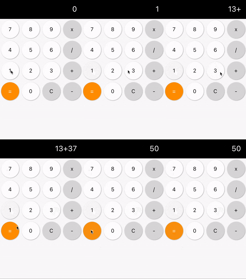
The idea is to implement a calculator whilst learning the basics of Flutter. It should be functional but not overly complicated to develop. For that reason, we delimit the feature set by the following:
- It should have the possibility to let the user perform all basic calculations: add, subtract, multiply, divide
- We do not work with float values, thus division only includes integers
- A clean button resets the state and enables the user to define a new calculation
- A bar at the top shows the current calculation with the first operand, the operator and the second operand
- After a tap on the equals sign the user is presented the result of the calculation
What you are going to learn
- Basic layouting using Rows and Columns
- Using a StatefulWidget to keep track of the state
- Extracting reusable UI into its own widget
- Making use of MediaQuery to determine the size of the screen
Implementation
Start a new Flutter project and replace the whole main.dart with this one:
Setup
 1import 'package:flutter/material.dart';
 2
 3void main() {
 4  runApp(CalculatorApp());
 5}
 6
 7class CalculatorApp extends StatelessWidget {
 8  @override
 9  Widget build(BuildContext context) {
10    return MaterialApp(
11      title: 'Flutter basic calculator',
12      home: Scaffold(
13        body: Calculation()
14      ),
15    );
16  }
17}
The root widget of our application is a MaterialApp. This gives us a lot of predefined functionality that are in line with Google’s Material Design. A Scaffold also provides a lot of APIs but for now it’s only relevant for us at it makes the default font look good.
The Calculation widget is not yet created, you should get an error saying “The method ‘Calculation’ isn’t defined for the type ‘CalculatorApp’”. We will fix it in a minute by implementing the widget. The purpose of it is to represent the screen that holds all of the UI elements of our calculator.
Putting separate functionality in its own widget is actually a good practice as it encapsulates responsibility. This is good for testing, performance and readability. Read this article for more information about it.
 1import 'package:flutter/material.dart';
 2
 3class Calculation extends StatefulWidget {
 4  @override
 5  _CalculationState createState() => _CalculationState();
 6}
 7
 8class _CalculationState extends State<Calculation> {
 9  int result;
10
11  @override
12  Widget build(BuildContext context) {
13    return ResultDisplay(text: '0');
14  }
15}
The widget needs to be a StatefulWidget because we want to hold information like the current result and later also the operands and the operator.
if you are unsure whether you need a StatefulWidget or a StatelessWidget, just start with a stateless one. Android Studio and VS Code offer a shortcut to convert a StatelessWidget to a StatefulWidget which you can use if you change your mind.
And for a dedicated tutorial on this topic, read this tutorial about StatelessWidget vs. StatefulWidget.
ResultDisplay
ResultDisplay is the only widget that will be displayed in our first iteration. It’s the top part of the calculator showing the result of the current calculation.
 1import 'package:flutter/material.dart';
 2
 3class ResultDisplay extends StatelessWidget {
 4  ResultDisplay({
 5    required this.text
 6  });
 7
 8  final int result;
 9
10  @override
11  Widget build(BuildContext context) {
12    return Container(
13      width: double.infinity,
14      height: 80,
15      color: Colors.black,
16      child: Text(
17        text,
18        style: TextStyle(
19          color: Colors.white,
20          fontSize: 34
21        ),
22      )
23    );
24  }
25}
We make our ResultDisplay widget a stateless widget. That’s because it does not change over time. The only dynamic part is the text itself, which the widget gets injected in the constructor. When the text changes, the parent widget will trigger a rebuild of this widget which makes it display the new text. If you want to know more about the difference of StatelessWidget and StatefulWidget and when to use which one, read more about it in this article.
We use Dart’s syntactic sugar for constructors that do nothing else but mapping the arguments to the class properties. This prevents a little bit of boilerplate.
Now we create a Container widget with infinite width because we want to span across the whole width of the screen and a fix of 80 pixels. We set the color attribute in order to determine the background color.
On top of that we want to display the result with a white color and a font size of 34. The text itself is the result of the text property of this class which gets it in the constructor.
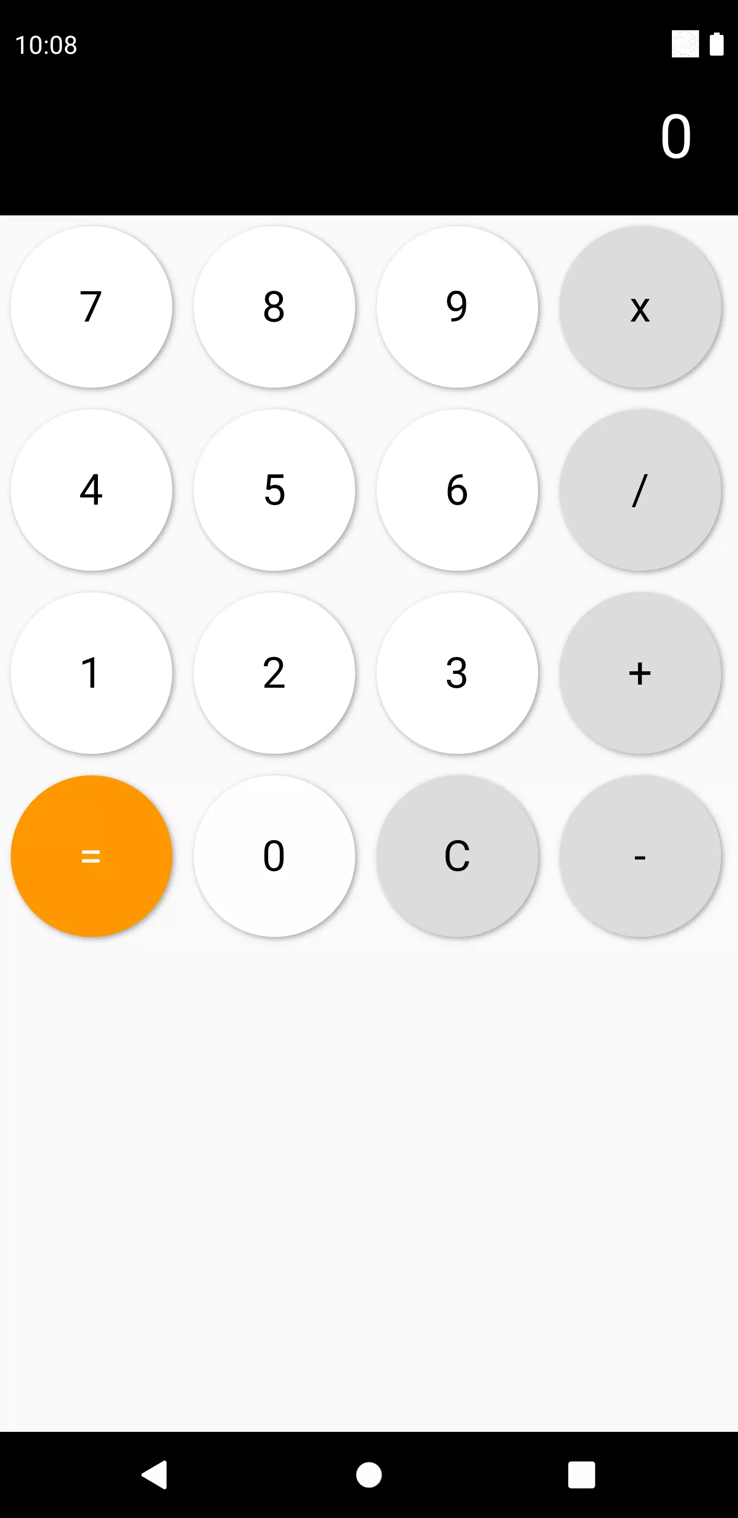
If you run the app now, it should look something like this:
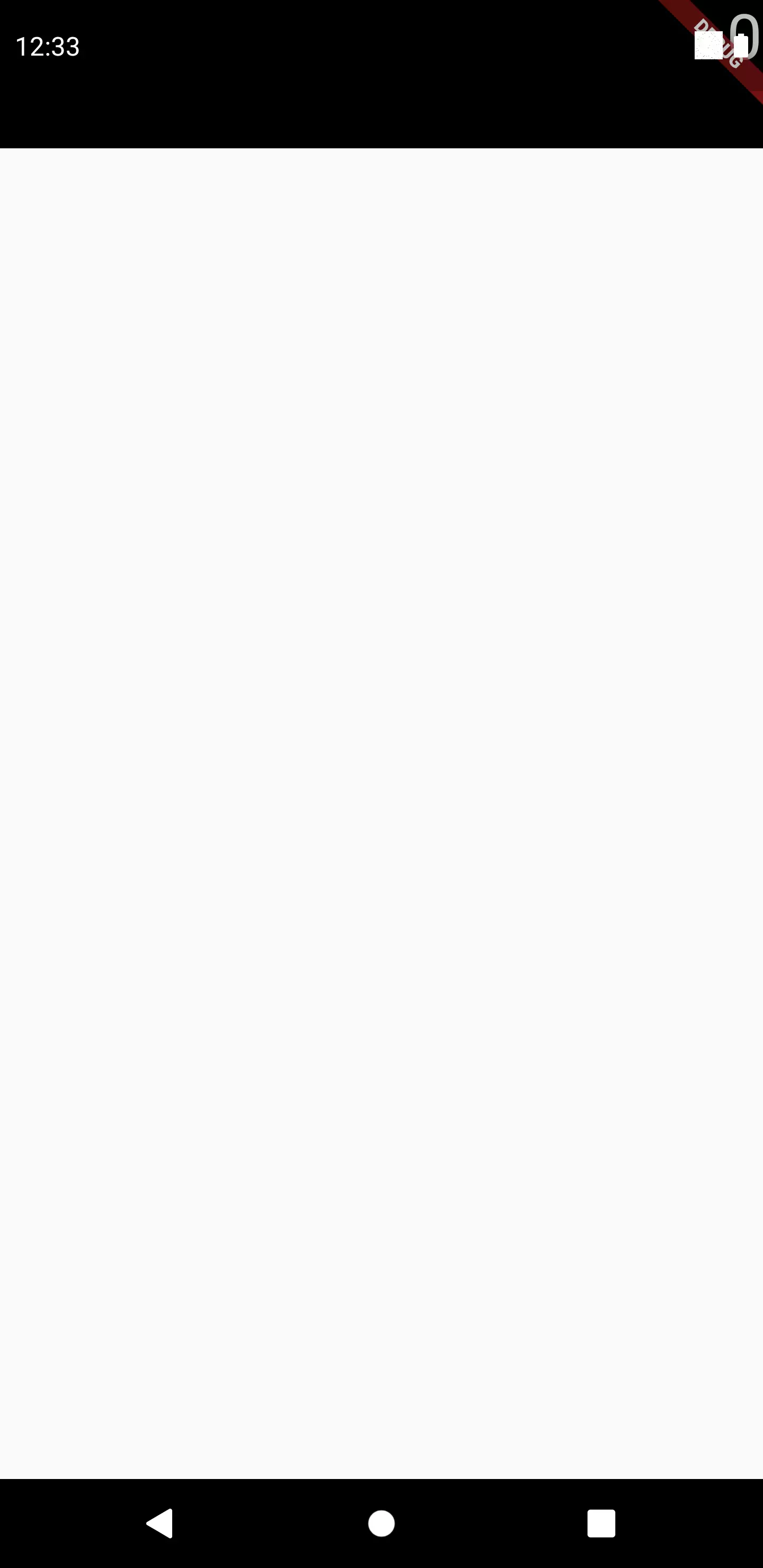
It’s a start, but apart from the debug banner and the status bar overlay which we are going to take care of afterwards, the 0 is not aligned the way we want. We want it to be centered vertically and have a padding to the right.
There are widgets called Align and Padding which we could use. However, we would have an unnecessary deep nesting with Align being parent of Padding being parent of Container. In fact, Align and Padding are nothing more than Container widgets with certain parameters set. So instead of nesting widgets, we just set the respective properties of our already existing Container widget:
 1@override
 2Widget build(BuildContext context) {
 3  return Container(
 4    width: double.infinity,
 5    height: 80,
 6    color: Colors.black,
 7    child: Container(
 8      alignment: Alignment.centerRight,
 9      padding: EdgeInsets.only(right: 24),
10      child: Text(
11        text,
12        style: TextStyle(
13        color: Colors.white,
14        fontSize: 34
15        ),
16      )
17    )
18  );
19}
Now let’s take care of the annoying debug banner and the status bar that covers our newly implemented widget. Getting rid of the debug banner is as simple as setting the debugShowCheckedModeBanner property in our MaterialApp:
 1@override
 2Widget build(BuildContext context) {
 3  return MaterialApp(
 4    debugShowCheckedModeBanner: false,
 5    title: 'Flutter basic calculator',
 6    home: Scaffold(
 7      body: Calculation()
 8    ),
 9  );
10}
Regarding the status bar, we have two options: either we extend our app into the notch and apply a top padding so that the status bar overlaps nothing particular useful or we decide to render our app content into a SafeArea. This is a possibility to prevent interference of the UI with the OS-specific top and bottom bars.
 1class CalculatorApp extends StatefulWidget {
 2  @override
 3  _CalculatorAppState createState() => _CalculatorAppState();
 4}
 5
 6class _CalculatorAppState extends State<CalculatorApp> {
 7  @override
 8  void initState() {
 9    SystemChrome.setSystemUIOverlayStyle(
10      SystemUiOverlayStyle(
11        statusBarColor: Colors.transparent,
12      )
13    );
14
15    super.initState();
16  }
17
18  @override
19  Widget build(BuildContext context) {
20    return MaterialApp(
21      debugShowCheckedModeBanner: false,
22      title: 'Flutter basic calculator',
23      home: Scaffold(
24        body: Calculation()
25      ),
26    );
27  }
28}
29
30class ResultDisplay extends StatelessWidget {
31…
32@override
33Widget build(BuildContext context) {
34  return Container(
35    width: double.infinity,
36    height: 120,
37    color: Colors.black,
38    child: Container(
39      alignment: Alignment.bottomRight,
40      padding: EdgeInsets.only(right: 24, bottom: 24),
41      child: Text(
42        text,
43        style: TextStyle(
44        color: Colors.white,
45        fontSize: 34
46      ),
47      )
48    )
49  );
50}
We turn the CalculatorApp into a StatefulWidget because we need the initState() method to perform an action once. Doing such tasks in the build() is not a good practice as it’s not guaranteed that the method is only executed once.
Instead of vertically centering the text, which would lead to it being halfway positioned inside the notch, we choose a bottom right alignment and a bottom padding of 24.
 1class CalculatorApp extends StatelessWidget {
 2  @override
 3  Widget build(BuildContext context) {
 4    return MaterialApp(
 5      title: 'Flutter basic calculator',
 6      home: Scaffold(
 7        body: SafeArea(
 8          child: Calculation()
 9        )
10      ),
11    );
12  }
13}
The other option is to wrap our Calculation widget in a SafeArea. The disadvantage is that the look of the app is not as immersive as there is a black bar at the top.
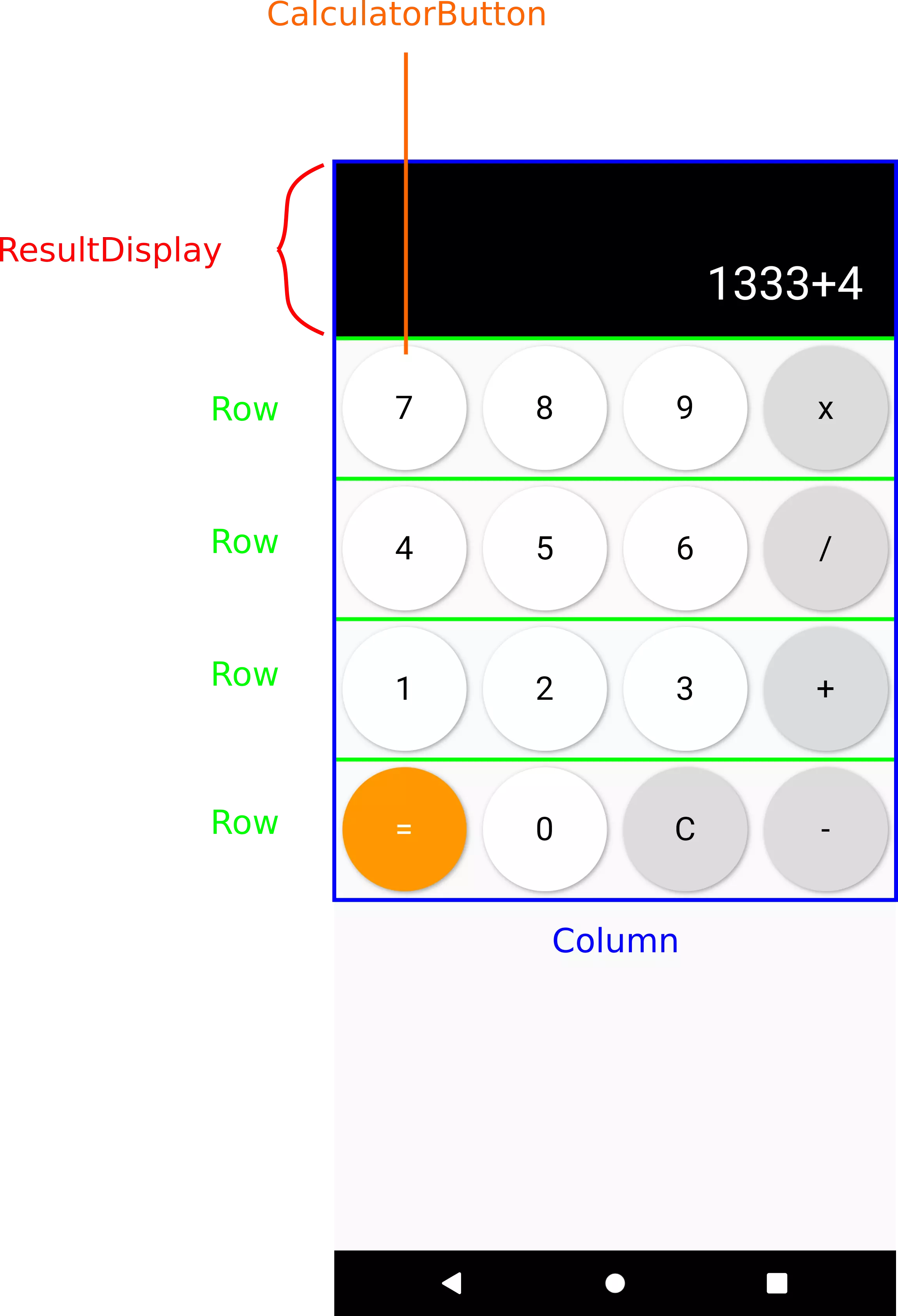
Excluding the ResultDisplay, there are 4 Rows within the Column. A Column allows for vertical widget placement. The Row likewise in the horizontal direction.
 1@override
 2Widget build(BuildContext context) {
 3  return Column(
 4    children: [
 5      ResultDisplay(text: '0'),
 6      Row(
 7        children: [
 8          // Here we want to place the buttons of the first Row
 9        ],
10      )
11    ]
12  );
13}
Creating the keypad button
Let’s design a widget first, that resembles a button on our keypad. It should be square, show its label and have a ripple effect on tap.
 1import 'package:flutter/material.dart';
 2
 3class CalculatorButton extends StatelessWidget {
 4  CalculatorButton({
 5    required this.label,
 6    required this.onTap,
 7    required this.size,
 8    this.backgroundColor = Colors.white,
 9    this.labelColor = Colors.black
10  });
11
12  final String label;
13  final VoidCallback onTap;
14  final double size;
15  final Color? backgroundColor;
16  final Color? labelColor;
17
18  @override
19  Widget build(BuildContext context) {
20    …
21  }
22}
Again, we use the shorthand constructor to assign the arguments to the member variables. These are:
label: What’s written on the button, e.g. a number or an operatoronTap: A callback that is executed whenever the button is tappedsize: The button’s dimension. We only need one value as the buttons are supposed to be squarebackgroundColor: The background color, which defaults to white because most of the buttons have a white backgroundlabelColor: The label color, which defaults to black because most of the buttons have a black label
Now that we have written the constructor, let’s design the build() that actually determines the visuals of our button.
 1@override
 2Widget build(BuildContext context) {
 3  return Padding(
 4    padding: EdgeInsets.all(6),
 5    child: Container(
 6      width: size,
 7      height: size,
 8      decoration: BoxDecoration(
 9        boxShadow: [
10          BoxShadow(
11            color: Colors.grey,
12            offset: Offset(1, 1),
13            blurRadius: 2
14          ),
15        ],
16        borderRadius: BorderRadius.all(
17          Radius.circular(size / 2)
18        ),
19        color: backgroundColor
20      ),
21      child: // Label text and other stuff here
22    )
23  );
24}
We start with a Padding widget that creates an inset around its child by the specified EdgeInsets. It’s important to do it this way and not use the padding property of the Container widget because while the former creates a margin, the latter creates a padding and what we want is a margin between the buttons of the keypad.
The container represents the button itself. width and height are both of the given size. In order to mimic a button, we add a drop shadow using the BoxShadow widget and the boxShadow property of the Container widget.
So far we have a rectangle. We turn it into a circle by using the borderRadius property with half the size.
The color property of a Container widget determines its background color. We set it to backgroundColor.
Now, let’s take care of the label and a ripple effect:
 1...
 2FlatButton(
 3  shape: CircleBorder(),
 4  onPressed: onTap,
 5  child: Center(
 6    child: Text(
 7      label,
 8      style: TextStyle(fontSize: 24, color: labelColor),
 9    )
10  ),
11),
12...
A FlatButton is a certain kind of MaterialButton. These widgets take care of the button’s styling and interaction behaves like Google’s Material Design prescribes it.
The official docs say:
Use flat buttons on toolbars, in dialogs, or inline with other content but offset from that content with padding so that the button's presence is obvious. Flat buttons intentionally do not have visible borders and must therefore rely on their position relative to other content for context. In dialogs and cards, they should be grouped together in one of the bottom corners. Avoid using flat buttons where they would blend in with other content, for example in the middle of lists.
Material design flat buttons have an all-caps label, some internal padding, and some defined dimensions. To have a part of your application be interactive, with ink splashes, without also committing to these stylistic choices, consider using InkWell instead.
Okay, while using a FlatButton would technically work, it doesn’t seem the right thing to use here, as we display it in a different way. Actually we only want a button with a ripple effect. Let’s follow the recommendation of the documentation and use an InkWell.
If we just replace the FlatButton by an InkWell, we would not see an effect. That’s because the parent Container has a background color that would cover everything we want to see. Flutter’s team is well aware of this circumstance and developed an Ink widget to address this issue.
 1@override
 2Widget build(BuildContext context) {
 3  return Padding(
 4    padding: EdgeInsets.all(6),
 5    child: Ink(
 6      width: size,
 7      height: size,
 8      decoration: BoxDecoration(
 9        boxShadow: [
10          BoxShadow(
11            color: Colors.grey,
12            offset: Offset(1, 1),
13            blurRadius: 2
14          ),
15        ],
16        borderRadius: BorderRadius.all(
17          Radius.circular(size / 2)
18        ),
19        color: backgroundColor
20      ),
21      child: InkWell(
22        customBorder: RoundedRectangleBorder(
23          borderRadius: BorderRadius.all(Radius.circular(size / 2)),
24        ),
25        onTap: onTap,
26        child: Center(
27          child: Text(
28            label,
29            style: TextStyle(fontSize: 24, color: labelColor),
30          )
31        ),
32      ),
33    )
34  );
35}
In order to maintain the circular shape, we apply a RoundedRectangleBorder as the customBorder property of the InkWell widget.
We display the button by placing it under the ResultDisplay:
 1Row(
 2  children: [
 3    CalculatorButton(
 4      label: '7',
 5      onTap: () => {},
 6      size: 90,
 7      backgroundColor: Colors.white,
 8      labelColor: Colors.black,
 9    )
10  ],
11)
We set the onTap to an empty function and the size to 90. We will change both of the values later.
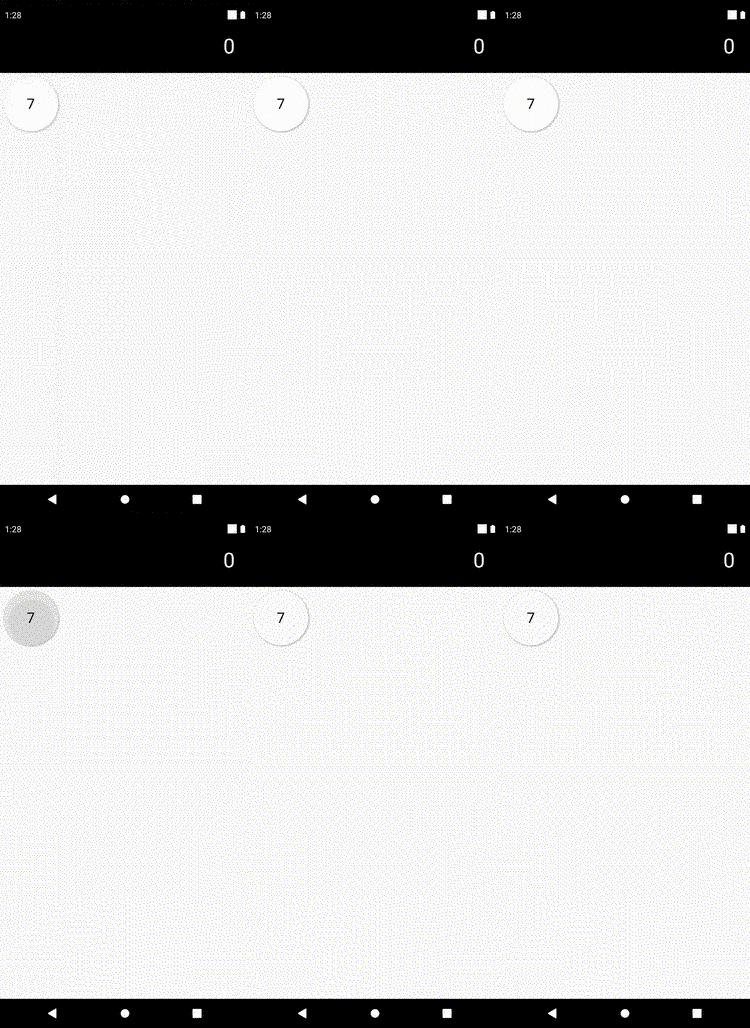
Great. Now, let’s fill the rest of the keypad. To simplify this, we wrap the CalculatorButton with a function. This way, we can define default values for the colors because most of the buttons have the same color combination. Also, when we set the size depending on the screen width, we don’t have to copy and paste this calculation for every Button.
1Widget _getButton({String text, Function onTap, Color backgroundColor = Colors.white, Color textColor = Colors.black}) {
2  return CalculatorButton(
3    label: text,
4    onTap: onTap,
5    size: 90,
6    backgroundColor: backgroundColor,
7    labelColor: textColor,
8  );
9}
Filling the keypad with buttons
Now, lets insert every button we know we are going to need.
 1@override
 2Widget build(BuildContext context) {
 3  return Column(
 4    children: [
 5      ResultDisplay(text: '0'),
 6      Row(
 7        children: [
 8          _getButton(text: '7', onTap: () => numberPressed(7)),
 9          _getButton(text: '8', onTap: () => numberPressed(8)),
10          _getButton(text: '9', onTap: () => numberPressed(9)),
11          _getButton(text: 'x', onTap: () => operatorPressed('*'), backgroundColor: Color.fromRGBO(220, 220, 220, 1)),
12        ],
13      ),
14      Row(
15        children: [
16          _getButton(text: '4', onTap: () => numberPressed(4)),
17          _getButton(text: '5', onTap: () => numberPressed(5)),
18          _getButton(text: '6', onTap: () => numberPressed(6)),
19          _getButton(text: '/', onTap: () => operatorPressed('/'), backgroundColor: Color.fromRGBO(220, 220, 220, 1)),
20        ],
21      ),
22      Row(
23        children: [
24          _getButton(text: '1', onTap: () => numberPressed(1)),
25          _getButton(text: '2', onTap: () => numberPressed(2)),
26          _getButton(text: '3', onTap: () => numberPressed(3)),
27          _getButton(text: '+', onTap: () => operatorPressed('+'), backgroundColor: Color.fromRGBO(220, 220, 220, 1))
28        ],
29      ),
30      Row(
31        children: [
32          _getButton(text: '=', onTap: calculateResult, backgroundColor: Colors.orange, textColor: Colors.white),
33          _getButton(text: '0', onTap: () => numberPressed(0)),
34          _getButton(text: 'C', onTap: clear, backgroundColor: Color.fromRGBO(220, 220, 220, 1)),
35          _getButton(text: '-', onTap: () => operatorPressed('-'),backgroundColor: Color.fromRGBO(220, 220, 220, 1)),
36        ],
37      ),
38    ]
39  );
40}
41...
42operatorPressed(String operator) {}
43numberPressed(int number) {}
44calculateResult() {}
45clear() {}
Empty functions were added for the callbacks being executed when a button is pressed. By filling these with actual content, we achieve interactivity.
Adding interactivity
We start by defining what happens when the number is tapped:
 1numberPressed(int number) {
 2  setState(() {
 3    if (result != null) {
 4      result = null;
 5      firstOperand = number;
 6      return;
 7    }
 8    if (firstOperand == null) {
 9      firstOperand = number;
10      return;
11    }
12    if (operator == null) {
13      firstOperand = int.parse('$firstOperand$number');
14      return;
15    }
16    if (secondOperand == null) {
17      secondOperand = number;
18      return;
19    }
20
21    secondOperand = int.parse('$secondOperand$number');
22  });
23}
There are different cases here:
- If the previous calculation is finished (thus result is not null), set the result to null and let the number that was just pressed to the new first operand
- If the first operand is null (this is the case at the beginning or when the clear button was pressed), set the first operand to the pressed number
- If the operator is null, pressing a number button will concat the number to the first operand. Otherwise we could only perform one-digit operations
- Same logic applies to the second operand
Now let’s take care of the user pressing a button with an operator:
1operatorPressed(String operator) {
2  setState(() {
3    if (firstOperand == null) {
4      firstOperand = 0;
5    }
6    this.operator = operator;
7  });
8}
Since the default value of the first operand is null, we have the case of somebody pressing an operator button with no set first operand. In this case we treat it like zero. We set the member variable operand to the given operand.
Okay, now let’s have a look at the function that is executed once the result button is tapped:
 1calculateResult() {
 2  if (operator == null || secondOperand == null) {
 3    return;
 4  }
 5  setState(() {
 6    switch (operator) {
 7      case '+':
 8        result = firstOperand + secondOperand;
 9        break;
10      case '-':
11        result = firstOperand - secondOperand;
12        break;
13      case '*':
14        result = firstOperand * secondOperand;
15        break;
16      case '/':
17        if (secondOperand == 0) {
18          return;
19        }
20        result = firstOperand ~/ secondOperand;
21        break;
22    }
23
24    firstOperand = result;
25    operator = null;
26    secondOperand = null;
27    result = null;
28  });
29}
The first part makes the function return when either the operator or the second operand is null. Because there is nothing to calculate if one of them is missing.
The second part is about actually performing the calculation. I guess every operator is fairly simple except for the multiply (*) operator. This is due to the fact that we do not support float numbers. That’s why we use ~/ which performs integer division. We also make sure that a division by zero is ruled out.
After the caclulation we instantly prepare the next calculation by setting the first operand to the result of our current calculation and resetting everything else to null.
We need to wrap everything with setState(). Otherwise the widget will not rebuild which will result in the changes not affecting the UI.
We will have a look at the behavior of the clear button now:
1clear() {
2  setState(() {
3    result = null;
4    operator = null;
5    secondOperand = null;
6    firstOperand = null;
7  });
8}
It’s as simple as resetting every variable to null.
Displaying the result
So far, we only display a “0” in the ResultDisplay. However, we want to display the calculation or the result depending on the current state.
 1ResultDisplay(
 2  text: _getDisplayText(),
 3)
 4...
 5String _getDisplayText() {
 6  if (result != null) {
 7    return '$result';
 8  }
 9
10  if (secondOperand != null) {
11    return '$firstOperand$operator$secondOperand';
12  }
13
14  if (operator != null) {
15    return '$firstOperand$operator';
16  }
17
18  if (firstOperand != null) {
19    return '$firstOperand';
20  }
21
22  return '0';
23}
Instead of providing ‘0’ as the text property of the constructor of our ResultDisplay, we choose the return value of the _getDisplayText() method.
This method returns the result if it is not null. If the second operand is set, it displays the whole calculation. If the operator is set, it displays the first operand and the operator. If only the first operator is set, it displays it. Finally if even the first operand is null (e. g. at startup time or when the user has pressed the clean button), it displays ‘0'.
Proper sizing of the buttons
There is one thing left to do and that’s having the UI being responsive instead of the buttons having a static size of 90.
 1class _CalculationState extends State<Calculation> {
 2  double width = 0;
 3
 4  int? firstOperand;
 5  String? operator;
 6  int? secondOperand;
 7  int? result;
 8
 9  @override
10  void didChangeDependencies() {
11    width = MediaQuery.of(context).size.width;
12    super.didChangeDependencies();
13  }
14  ...
15  Widget _getButton({String text, Function onTap, Color backgroundColor = Colors.white, Color textColor = Colors.black}) {
16    return CalculatorButton(
17      label: text,
18      onTap: onTap,
19      size: width / 4 - 12,
20      backgroundColor: backgroundColor,
21      labelColor: textColor,
22    );
23  }
We add a member variable called width. This will hold the width of the screen. We use didChangeDependencies() in order to obtain the screen width and set the variable to its width value. didChangeDependencies() is called after initState(). We can not use initState() because we need the BuildContext to obtain the screen width which is not available yet.
To determine the size of a button we simply divide the screen width by four because we have four buttons in a row.
Final words
In this beginner tutorial we implemented a calculator that enables the user to do basic calculations. We extracted the responsibilities in separate widgets to keep the code readable.
Feel free to extend the example by things like floats support, addition operators like square root or a history of all calculations.


Matt
Matt
In reply to Matt's comment
Marc
In reply to Matt's comment
David Ama