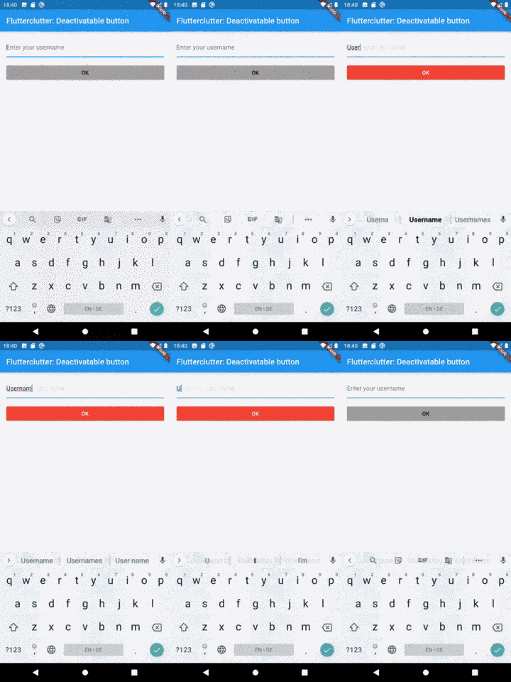
It sounds like a trivial task: you want to disable a button based on condition. For example: there is a login screen, in which the user needs to enter username and password. As long as one of the textfields is empty, the user should be signaled that it’s pointless to tap the login button by showing it in a disabled state.
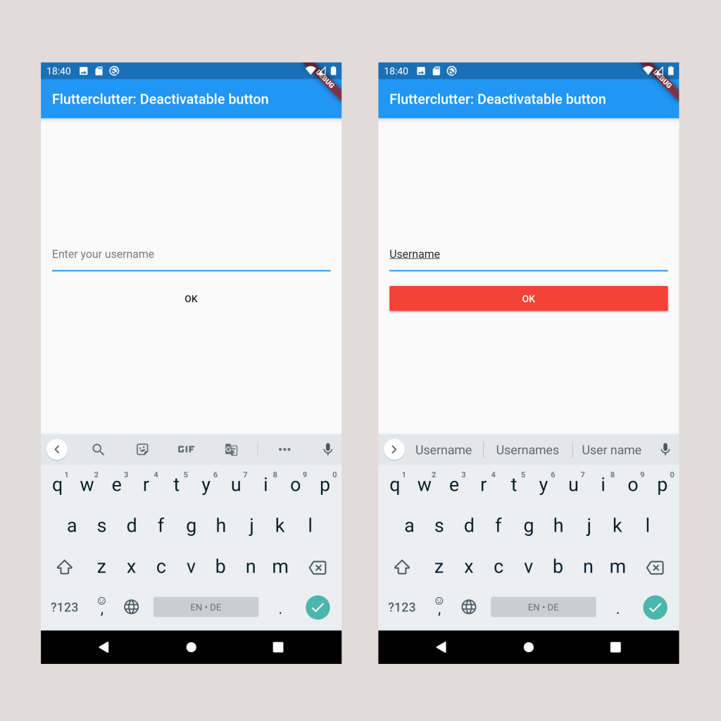
So basically we want something like this:
Intuitively, you would probably search for a constructor argument named activated, deactivated, enabled, disabled or something like that. Actually, there is none. However, there is a required argument, the Flutter team decided to give two purposes:
Buttons are disabled by default. To enable a button, set its onPressed or onLongPress properties to a non-null value.
This is from the documentation of the enabled property of MaterialButtons. So the callback functions have the purpose of providing a callback when the respective action happens but also disable the button if the given argument is null.
The easy but not-so-intuitive way
So we need to do something likes this:
1FlatButton(
2  onPressed: !_bothTextFieldsContainText() ? null : () => _performLogin,
3  child: Text('Login')
4);
Where _bothTextFieldsContainText() returns true if login and password contain at least one character and _performLogin executes the login procedure.
In my opinion, the caller needs to take care of something that should be an internal logic of the button. To me, the button being in disabled state when the callback is null, is a side-effect and disregards the SRP. One responsibility is to provide the callback, the other one is the UI-specific change that occurs in the absence of that property.
I also try to avoid the ternary operator whenever I can because it takes a little more time in my brain to process than a separate function with a classic if statement.
The not-so-easy but more intuitive way (for the caller)
Let’s provide a widget in which you can inject a button that expects a property isDeactivated. So it should be usable like this:
1DeactivatableButton(
2  isDeactivated: !_bothTextFieldsContainText(),
3  child: RaisedButton(
4    ...
5  ),
6);
That’s cool because we can inject any type of MaterialButton. If we were to extend an existing button type like FlatButton, RaisedButton or OutlineButton, it would only work for these kinds.
What do we have to do? We have to create a new class that extends StatelessWidget (as the state of the deactivated button is controlled by the caller). We then return a MaterialButton that returns null for onPressed and onLongPressed as long as the isDeactivated property is set:
 1class DeactivatableButton extends StatelessWidget {
 2  DeactivatableButton({
 3    Key key,
 4    @required this.child,
 5    @required this.isDeactivated,
 6  }) : super(key: key);
 7
 8  final MaterialButton child;
 9  final bool isDeactivated;
10
11  @override
12  Widget build(BuildContext context) {
13    return MaterialButton(
14      onPressed: isDeactivated ? null : child.onPressed,
15      onLongPress: isDeactivated ? null : child.onLongPress,
16      onHighlightChanged: child.onHighlightChanged,
17      textTheme: child.textTheme,
18      textColor: child.textColor,
19      disabledTextColor: child.disabledTextColor,
20      color: child.color,
21      disabledColor: child.disabledColor,
22      focusColor: child.focusColor,
23      hoverColor: child.hoverColor,
24      highlightColor: child.highlightColor,
25      splashColor: child.splashColor,
26      colorBrightness: child.colorBrightness,
27      elevation: child.elevation,
28      focusElevation: child.focusElevation,
29      hoverElevation: child.hoverElevation,
30      highlightElevation: child.highlightElevation,
31      disabledElevation: child.disabledElevation,
32      padding: child.padding,
33      visualDensity: child.visualDensity,
34      shape: child.shape,
35      clipBehavior: child.clipBehavior,
36      focusNode: child.focusNode,
37      autofocus: child.autofocus,
38      materialTapTargetSize: child.materialTapTargetSize,
39      animationDuration: child.animationDuration,
40      minWidth: child.minWidth,
41      height: child.height,
42      enableFeedback: child.enableFeedback,
43      child: child.child,
44    );
45  }
46}
Wow, that’s a lot of code for such a simple functionality. That’s because MaterialButton’s constructor has lots of optional arguments. We want every argument to be like the child ones except for onPressed and onLongPressed as they control the disabled state.
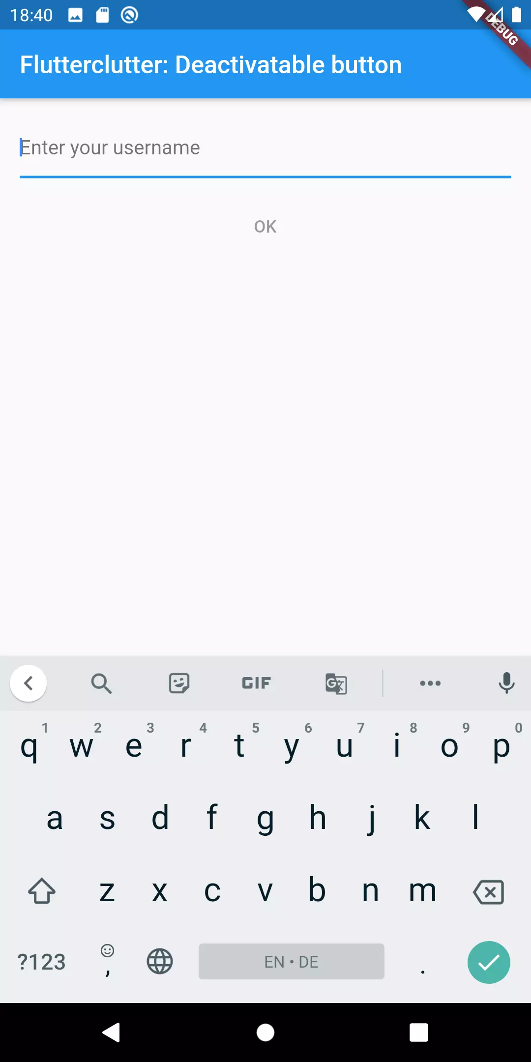
Before typing
After started typing
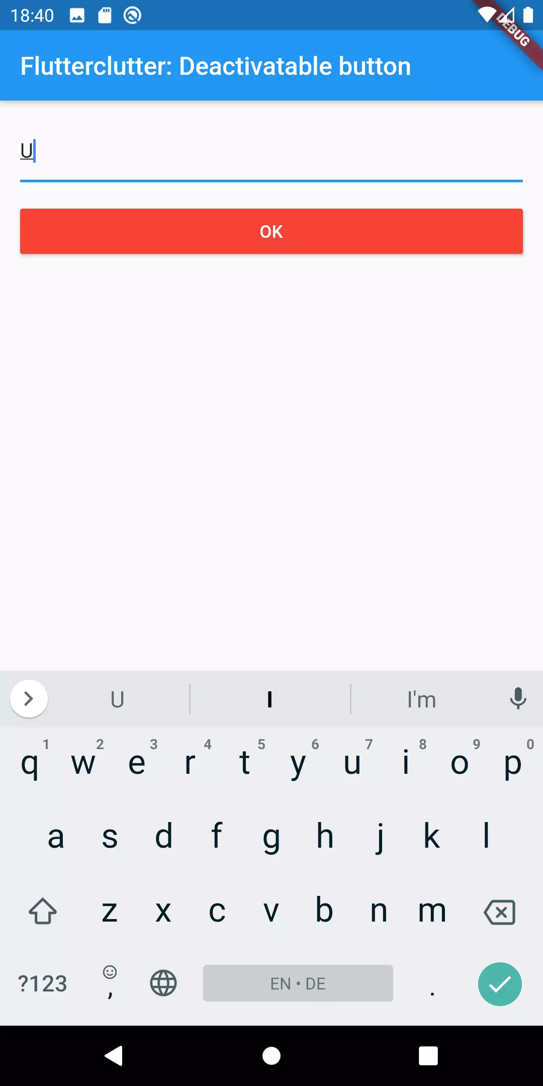
The styling of the disabled state can be altered using disabledColor, disabledTextColor and disabledElevation. So if for some reason we would want the disabled state to be with blue background color and white text color, we could do it like this:
 1DeactivatableButton(
 2  isDeactivated: !_isButtonActivated,
 3  child: RaisedButton(
 4    textColor: Colors.white,
 5    color: Colors.red,
 6    disabledColor: Colors.blue,
 7    disabledTextColor: Colors.white,
 8    onPressed: () {
 9      ...
10    },
11    child: Text('OK'),
12  ),
13);
Extending the functionality by giving feedback
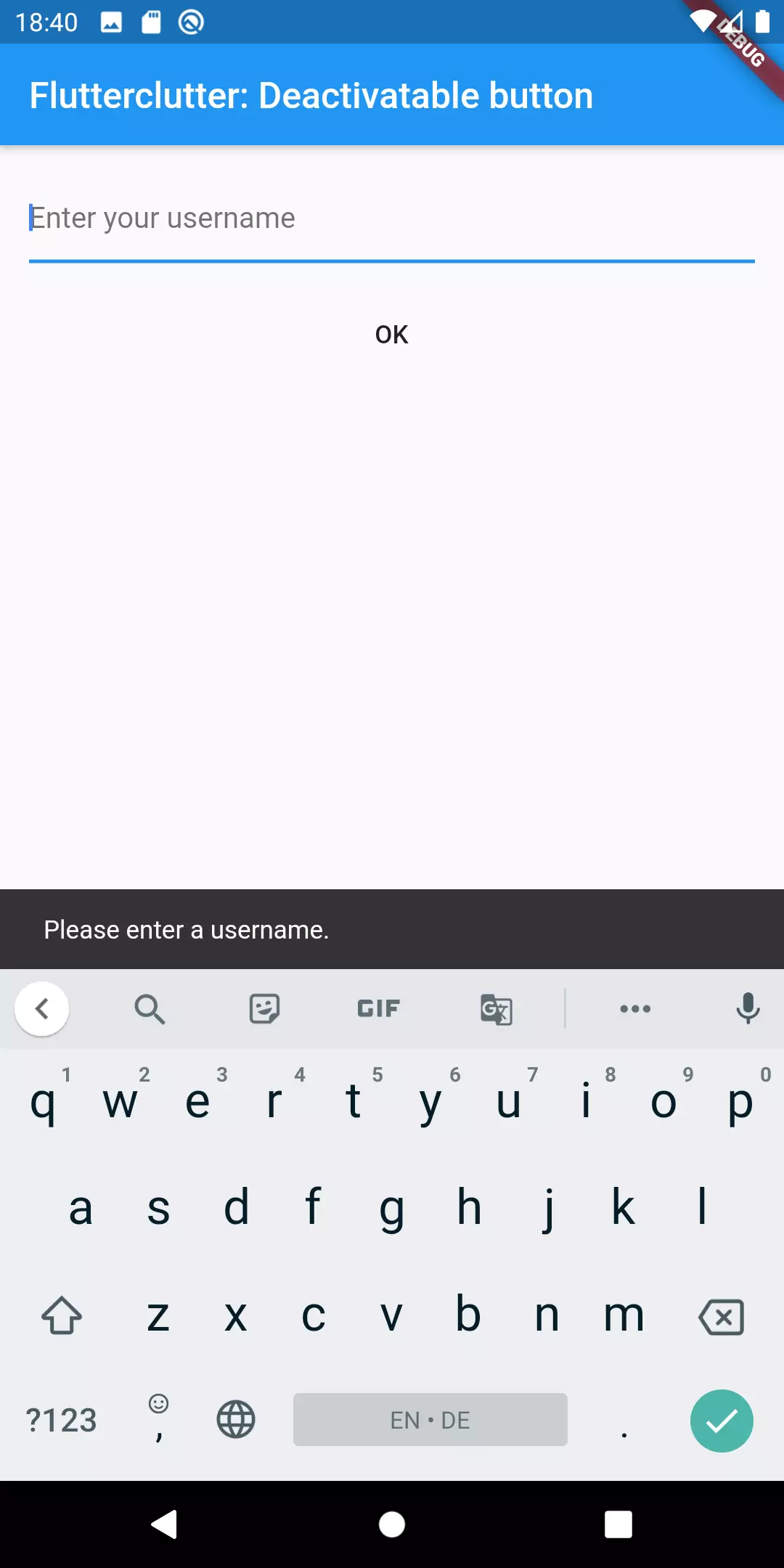
Now, what if we have the above situation and we would want the user to see a snackbar with an error message if he were to tap the disabled button?
Let’s extend our newly created widget by an argument called onTapWhenDeactivated. This argument expects a callback function that is executed when the user taps the disabled button.
 1DeactivatableButton({
 2    Key key,
 3    @required this.child,
 4    @required this.isDeactivated,
 5    this.onTapWhenDeactivated =  _returnNull,
 6  }) : super(key: key);
 7
 8  final MaterialButton child;
 9  final bool isDeactivated;
10  final Function onTapWhenDeactivated;
11
12  static _returnNull() => null;
13
14  @override
15  Widget build(BuildContext context) {
16    return MaterialButton(
17      onPressed: isDeactivated ? onTapWhenDeactivated : child.onPressed,
18      onLongPress: isDeactivated ? onTapWhenDeactivated : child.onLongPress,
19      ...
20  );
21}
Okay now there’s a new parameter which defaults to returnNull which is a static function. Why have I done it this way and not just written this.onTapWhenDeactivated = const (() => null);?
It’s because the Dart keyword const is used for object instantiation for values that are already being set at compile time. This is only supported for the following values:
- Primitive types (int, bool, …)
- Literal values (e.g. string literal: ‘this is a string literal’)
- Constant constructors
So no mentioning of functions there. Although there is a respective github issue that’s been open since 2008. That’s why we need to use static functions because they don’t change at runtime.
If we try the above mentioned code we realize: yes, the onTapWhenDeactivated callback is called when the user taps the disabled button, but the disabled button does not look disabled. That’s because like I said above, MaterialButton only declares its state as disabled when both of the callbacks (onPressed, onLongPress) are set to null. So we need to mimic that behavior by setting the corresponding values to the disabled values when isDeactivated is true.
This affects the following attributes:
- textColor
- color
- splashColor
- highlightColor
- highlightElevation
- elevation
So our new widget version looks like this:
 1@override
 2  Widget build(BuildContext context) {
 3    return MaterialButton(
 4      onPressed: isDeactivated ? onTapWhenDeactivated : child.onPressed,
 5      onLongPress: isDeactivated ? onTapWhenDeactivated : child.onLongPress,
 6      onHighlightChanged: child.onHighlightChanged,
 7      textTheme: child.textTheme,
 8      textColor: _getTextColor(),
 9      disabledTextColor: child.disabledTextColor,
10      color: _getColor(),
11      disabledColor: child.disabledColor,
12      focusColor: child.focusColor,
13      hoverColor: child.hoverColor,
14      highlightColor: _getHighlightColor(),
15      splashColor: _getSplashColor(),
16      colorBrightness: child.colorBrightness,
17      elevation: _getElevation(),
18      focusElevation: child.focusElevation,
19      hoverElevation: child.hoverElevation,
20      highlightElevation: _getHighlightElevation(),
21      disabledElevation: child.disabledElevation,
22      padding: child.padding,
23      visualDensity: child.visualDensity,
24      shape: child.shape,
25      clipBehavior: child.clipBehavior,
26      focusNode: child.focusNode,
27      autofocus: child.autofocus,
28      materialTapTargetSize: child.materialTapTargetSize,
29      animationDuration: child.animationDuration,
30      minWidth: child.minWidth,
31      height: child.height,
32      enableFeedback: child.enableFeedback,
33      child: child.child,
34    );
35  }
36
37  double _getElevation() {
38    return isDeactivated ? child.disabledElevation : child.elevation;
39  }
40
41  double _getHighlightElevation() {
42    return isDeactivated ? child.disabledElevation : child.highlightElevation;
43  }
44
45  Color _getHighlightColor() {
46    return isDeactivated ? Colors.transparent : child.highlightColor;
47  }
48
49  Color _getSplashColor() {
50    return isDeactivated ? Colors.transparent : child.splashColor;
51  }
52
53  Color _getTextColor() {
54    if (isDeactivated) {
55      return child.disabledTextColor;
56    }
57    return child.textColor;
58  }
59
60  Color _getColor() {
61    if (isDeactivated) {
62      return child.disabledColor;
63    }
64    return child.color;
65  }
Result
And this is what the final result looks like (after tapping the deactivated button):
Caveat
You have probably noticed that we had to touch many arguments of the MaterialButton constructor. This is a little bit flaky. When the API of that class changes in a new version of Flutter, it could be possible that our widget does not work anymore. At least not the way it used to work. Also, Flutter seemingly wants to handle the disabled state by using the nullability of the callbacks. Everything that goes in a different direction might be a problem in the future.
Conclusion
We have discussed two ways of implementing a button that can be disabled. The first sets the callbacks to null when the state is supposed to be disabled. The second one is creating a widget hat expects a button, an isDisabled argument and the behavior that is executed when somebody taps the disabled button.
Depending on how you want to embed the button, which parts of the behavior you want to control and how near you want to stay to the MaterialButton implementation, you can choose between the two approaches.

ปั้มไลค์
Marc
In reply to ปั้มไลค์'s comment
더킹카지노
Robby
Marc
In reply to Robby's comment
Reinier
Marc
In reply to Reinier's comment
Tim
Marc
In reply to Tim's comment