
The typical app user is used to having the possibility to clear the whole text inside of a text field with one tap. Both iOS and Android natively display a respective button at the end of the text field whenever the user starts typing.
This functionality is not mandatory and so Flutter does not provide it to TextFields by default but makes it very easy to implement it.
Let’s setup a simple app with a TextField at the bottom:
 1class MyHomePage extends StatefulWidget {
 2  MyHomePage({Key key, this.title}) : super(key: key);
 3  final String title;
 4
 5  @override
 6  _MyHomePageState createState() => _MyHomePageState();
 7}
 8
 9class _MyHomePageState extends State<MyHomePage> {
10  final TextEditingController _textEditingController = TextEditingController();
11
12  @override
13  Widget build(BuildContext context) {
14      return Scaffold(
15        appBar: AppBar(
16        title: Text(widget.title),
17      ),
18        body: Align(
19          alignment: Alignment.bottomCenter,
20          child: Container(
21            padding: EdgeInsets.all(16),
22            child: _getTextField()
23          )
24        ),
25      );
26    }
27
28  TextField _getTextField() {
29    return TextField(
30      controller: _textEditingController,
31      decoration: InputDecoration(
32        hintText: "Enter a beautiful text"
33      ),
34    );
35  }
36}

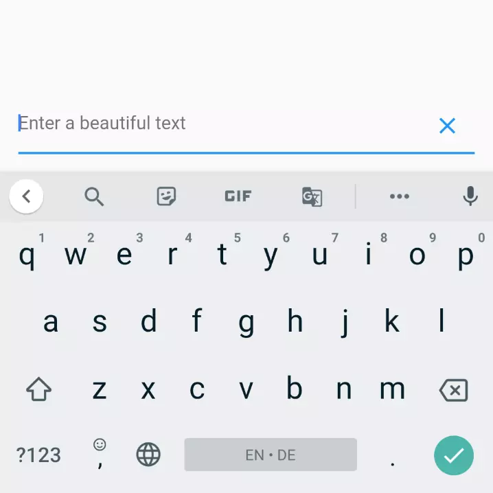
It gives us this simple screen.
In order to display something that’s located at the end of the TextField, we can use the suffixIcon argument of the widget. The title is misleading to a certain degree as it’s not necessarily an icon. In fact, the expected type is a Widget. So we’re not limited in any way:

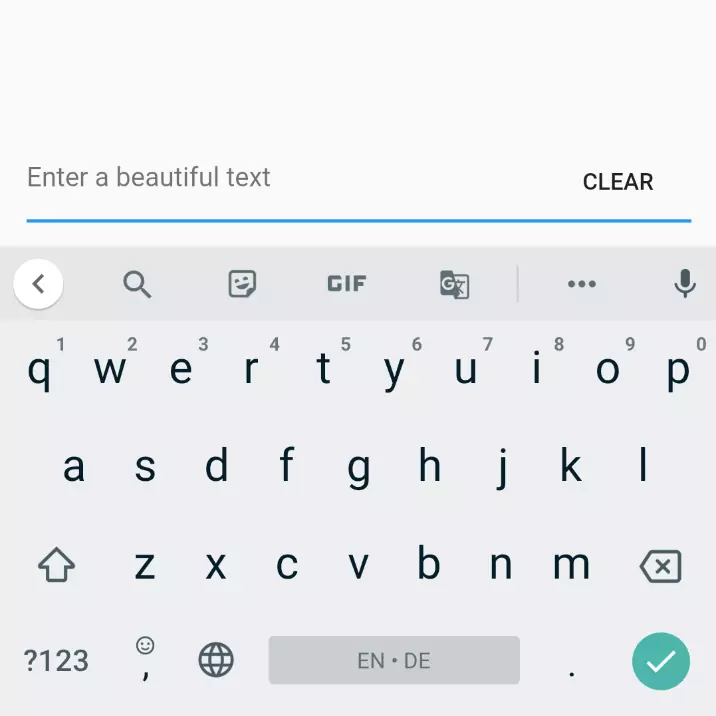
WidgetShow it only when there’s text
That also enables us to easily show the button only under certain conditions. In this case: when the text field is not empty:
 1bool _showClearButton = false;
 2
 3@override
 4void initState() {
 5  super.initState();
 6  _textEditingController.addListener(() {
 7    setState(() {
 8      _showClearButton = _textEditingController.text.length > 0;
 9    });
10  });
11}
12
13TextField _getTextField() {
14  return TextField(
15    controller: _textEditingController,
16    decoration: InputDecoration(
17      hintText: "Enter a beautiful text",
18      suffixIcon: _getClearButton(),
19    ),
20  );
21}
22
23Widget _getClearButton() {
24  if (!_showClearButton) {
25    return null;
26  }
27
28  return IconButton(
29    onPressed: () => _textEditingController.clear(),
30    icon: Icon(Icons.clear),
31  );
32}
So what I did:
- I added a variable
_showClearButtonthat’s storing whether the clear button is to be shown or not - In the
setState()method I attached a listener to the controller of theTextFieldthat updates the above mentioned value once there was a change - Lastly, I created a method that returns a button. If
_showClearButtonis false, it returns null, resulting in the button not being displayed. Otherwise, the button is displayed.onPressedhas a function assigned to clear the text
What does it look like?

As a standalone Widget
If you want a standalone Widget which you can use everywhere by typing ClearableTextfield(), use this piece of code and ideally put it in a separate file called clearable_textfield.dart:
 1import 'package:flutter/material.dart';
 2
 3class ClearableTexfield extends StatefulWidget {
 4  ClearableTexfield({
 5    Key key,
 6    this.controller,
 7    this.hintText = 'Enter text'
 8  }) : super(key: key);
 9
10  final TextEditingController controller;
11  final String hintText;
12
13  @override
14  State<StatefulWidget> createState() {
15    return _ClearableTextfieldState();
16  }
17}
18
19class _ClearableTextfieldState extends State<ClearableTexfield> {
20  bool _showClearButton = false;
21
22  @override
23  void initState() {
24    super.initState();
25    widget.controller.addListener(() {
26      setState(() {
27        _showClearButton = widget.controller.text.length > 0;
28      });
29    });
30  }
31
32  @override
33  Widget build(BuildContext context) {
34    return TextField(
35      controller: widget.controller,
36      decoration: InputDecoration(
37        hintText: widget.hintText,
38        suffixIcon: _getClearButton(),
39      ),
40    );
41  }
42
43  Widget _getClearButton() {
44    if (!_showClearButton) {
45      return null;
46    }
47
48    return IconButton(
49      onPressed: () => widget.controller.clear(),
50      icon: Icon(Icons.clear),
51    );
52  }
53}


Comment this 🤌