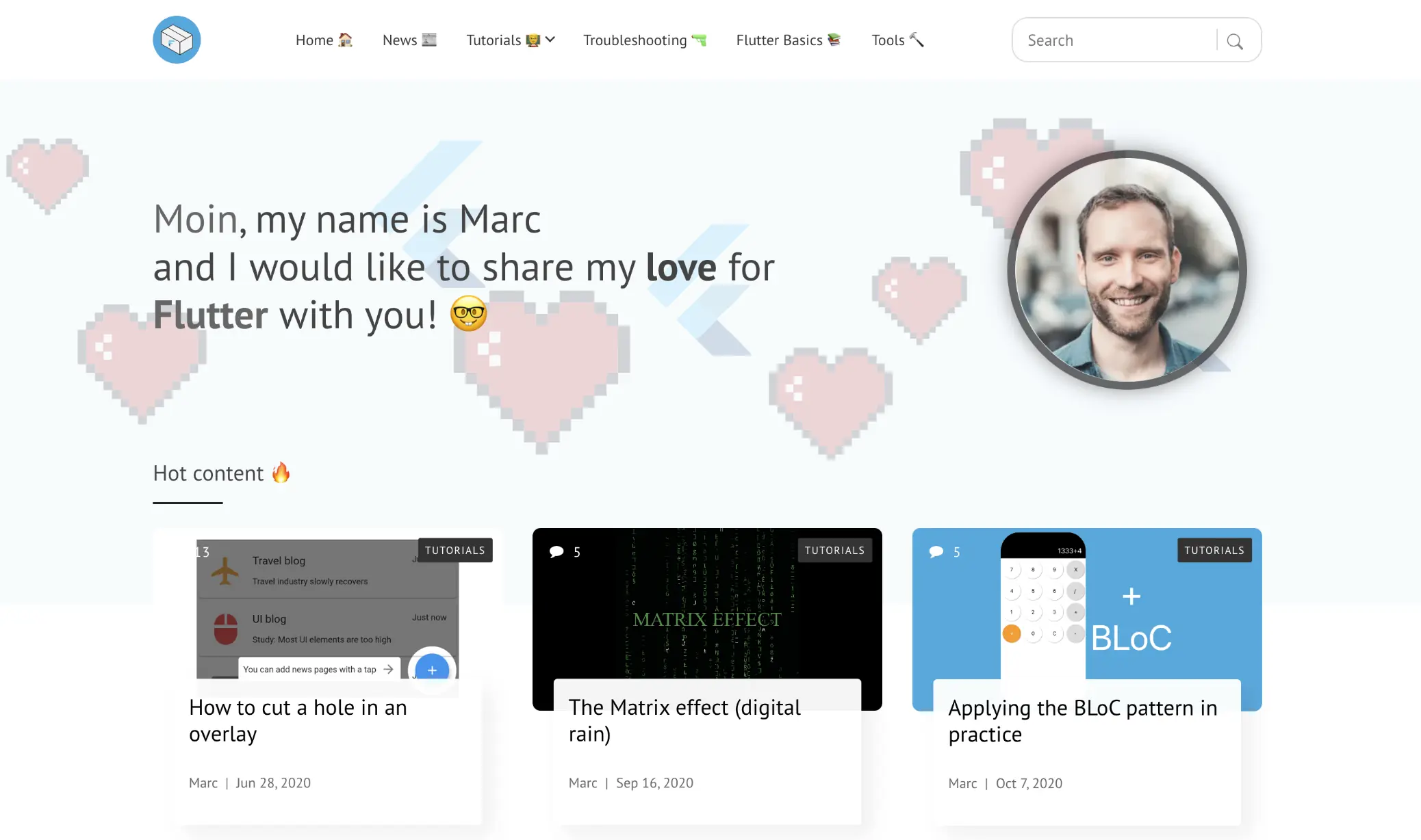
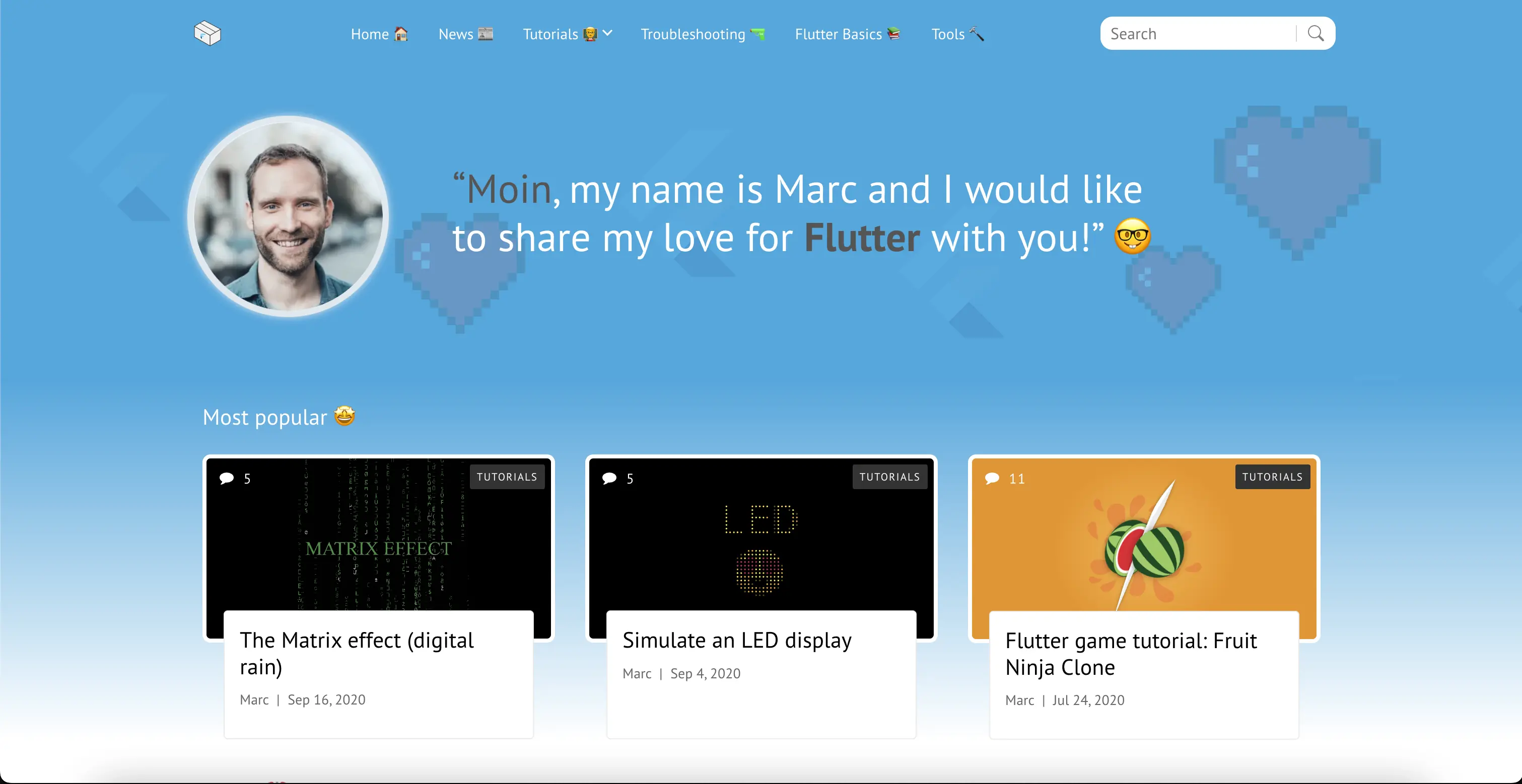
As you might have noticed, the design of the website has changed a little bit.
It was time for a change
The reason for this is more emotional than rational: I felt it was time for a change because having looked at the website no longer appealed to me.
The lack of colors had made the website look sterile and monotonous.
What has changed?
I decided to be a little bolder with colors and turned the top bar to the Flutterclutter blue and the part of the background underneath to a gradient that also starts with that color.
It looked a lot fresher but this led to many other tweaks a I had to make:
- Text that finds itself inside the gradient doesn’t stand out if it’s dark. That’s why I had to change a lot of text colors, especially of headlines
- The article images in the feature slider are mostly blueish. In order to make them more eye-catching, I gave all of them a white border
- The top bar has had a light background. The contrast to the background of the center part was too hard now so I made the top bar blue as well
- This way I had to adapt the links and the overlay menu as well
Things I have changed apart from that:
- For lots of the website content, I hadn’t used the whole 12-columns of the layout. Instead, many parts only used 10 columns. I decided to use the whole space everywhere
- I made the top bar tinier (including logo and search bar)
- The introduction part on the start page became smaller as well
- In the articles, I removed the card-like boxes with white backrground and box shadow
- Images in the feature slider were differing in height which I normalized
… and many other smaller tweaks!
Before / After
Now let’s take a glance at the page that changed the most: the start page, looking at the visual changes.


In my opinion, the work was worth it. The page looks younger, more open-minded and just more modern.
The space is used much better as the whole width is being used everywhere and elements with unnecessary height have been shrinked.
I enjoy these kinds of changes from time to time just like the migration from Wordpress to Hugo last year, which was technical and a visual change.
If you have any suggestions or opinions, feel free to comment or contact me directly.


Comment this 🤌