Displaying images with rounded corners or even as a circle is a pretty common design requirement. Rectangular images can look rather harsh and sometimes don’t fit into a modern design.
You can’t always control the image source, especially when you are working with APIs, so premature image editing is not always an option.
That’s where runtime clipping comes into play.
Let’s see how we can create a widget that displays all kinds of images with rounded corners.
Image as a rounded rectangle
Let’s look at images with rounded corners first.
Keeping the original shape
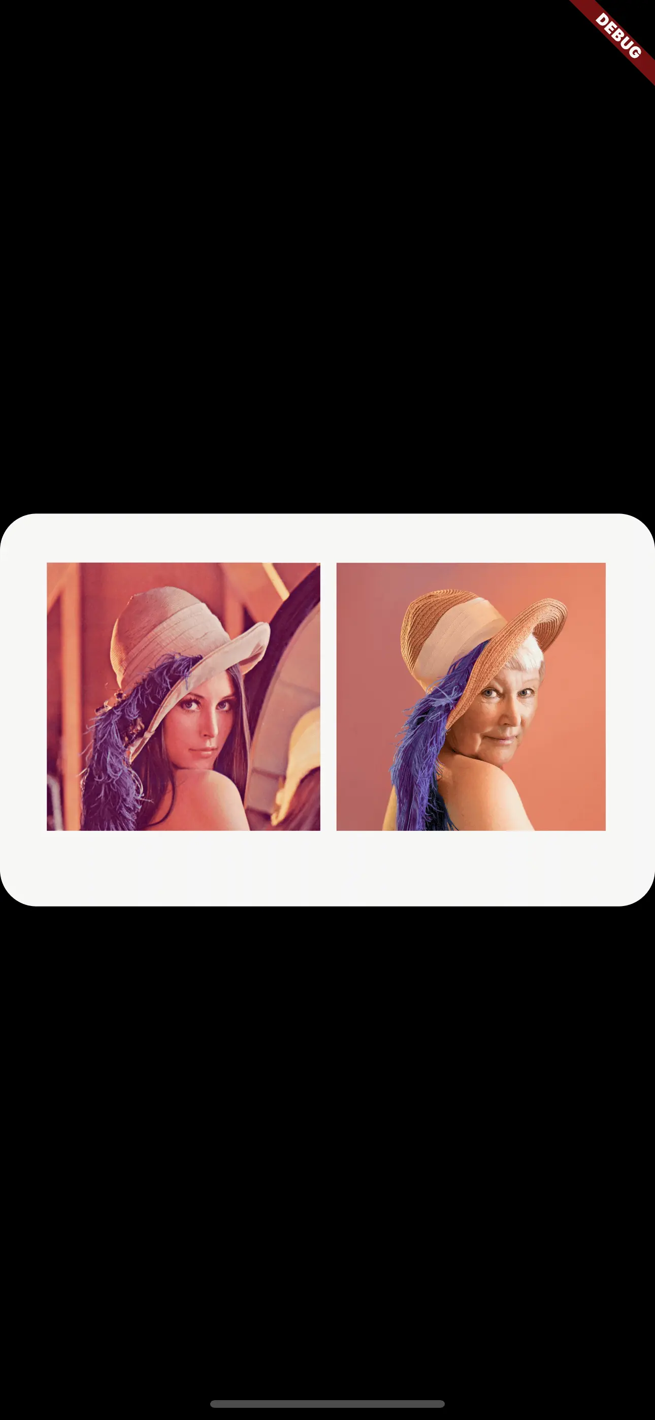
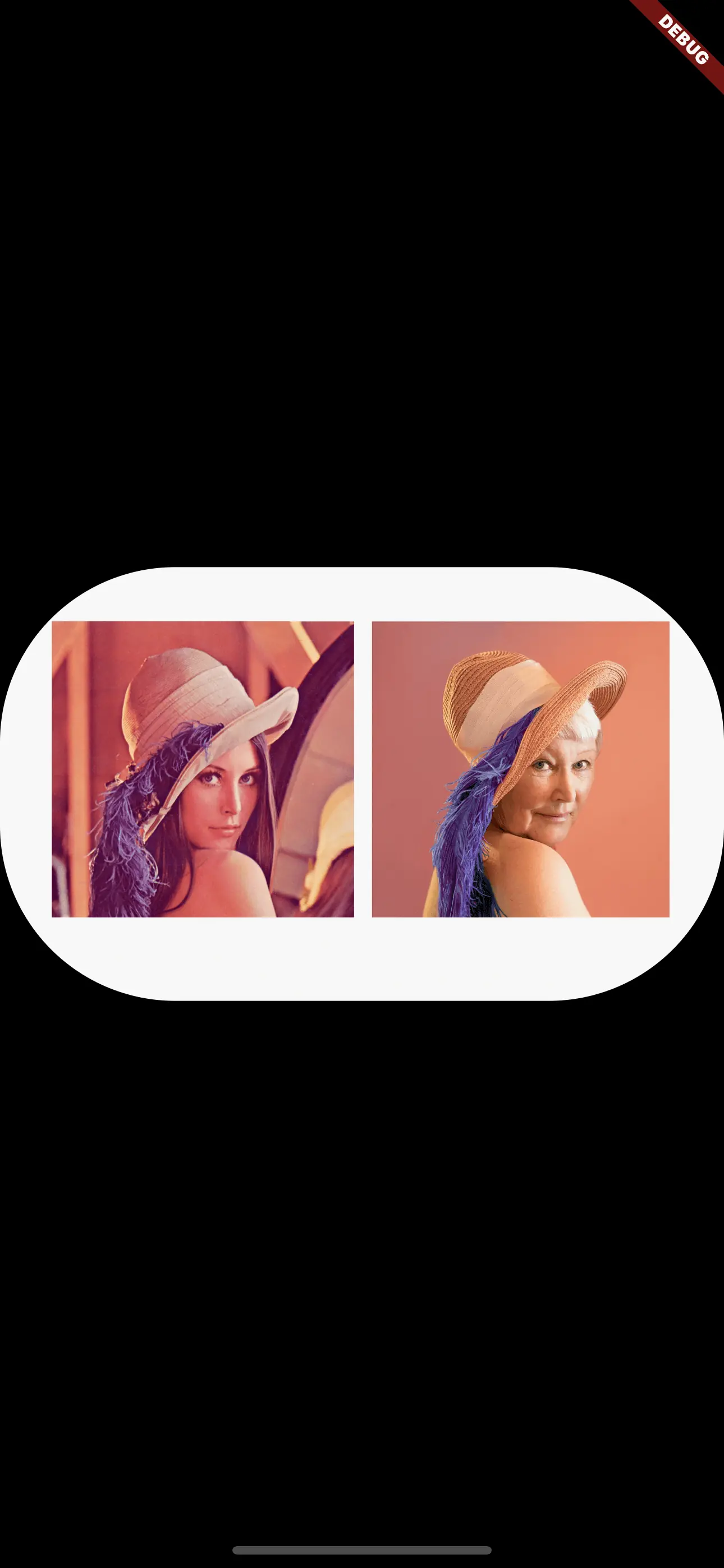
If the rectangle is not square, then you might want to keep its shape instead of making it a square.
In this case, you can wrap your Image widget with a ClipRRect widget.
There are different types of Clip widgets like ClipRect, ClipOval and the aforementioned ClipRRect. The base principle is always the same: the Clip defines boundaries. The child widget may exceed these boundaries and if it does, then this part of the child widget is not displayed.
An interesting example usage of Clip (in this case ClipPath) is cutting “holes” in widgets like it was explained in this tutorial.
ClipRect also has an additional argument that lets us define the border radius of the corners:
1ClipRRect(
2  borderRadius: BorderRadius.circular(24),
3  child: Image.network(
4    'https://my.image.url',
5  ),
6)
Making the image square
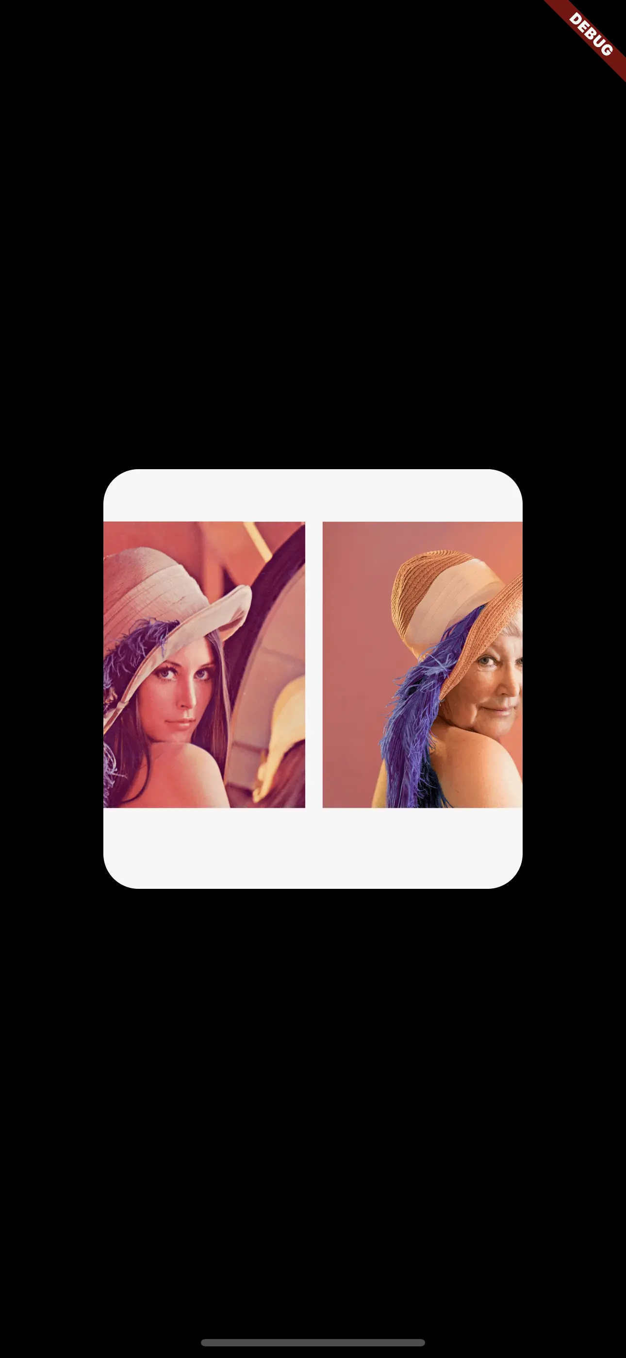
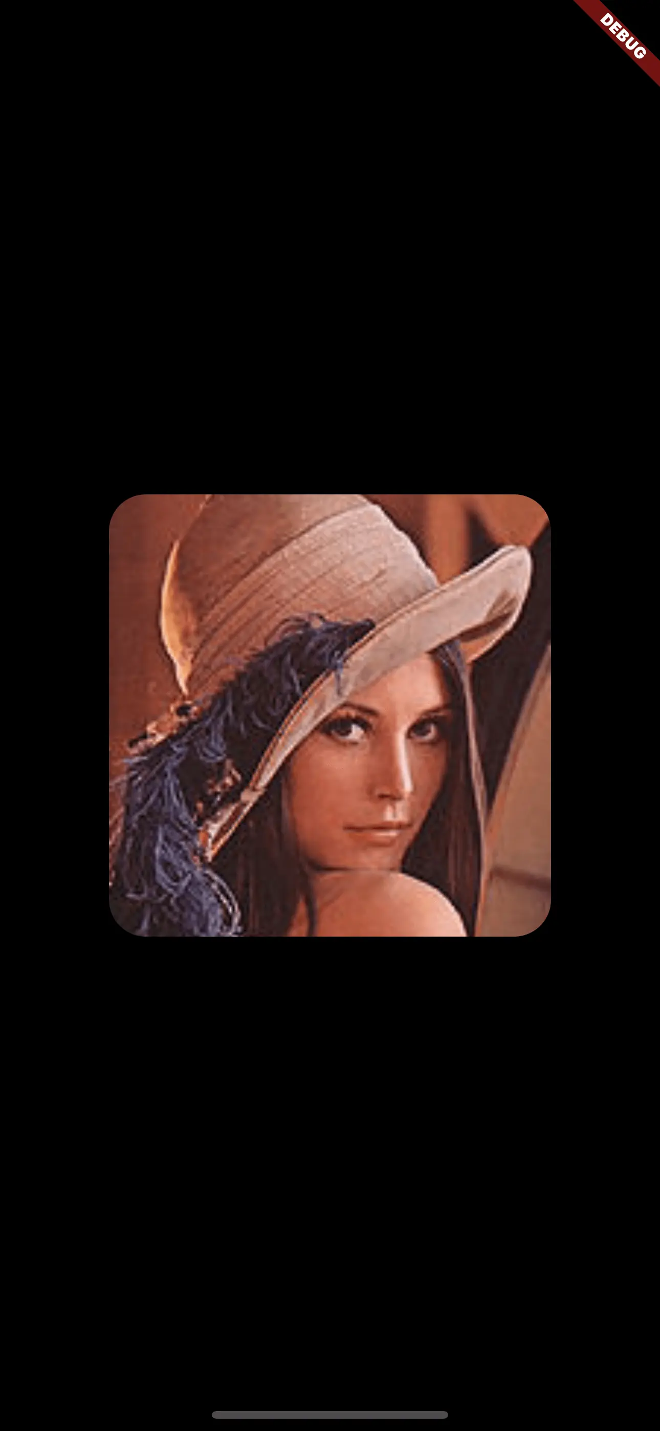
A common use case for normalized images that have a square shape are e. g. lists that all have a thumbnail image. Independent of the actual size of the image and its proportions, you might want to display the image as a square shape with rounded borders.
Here’s how that’s done:
 1ClipRRect(
 2  borderRadius: BorderRadius.circular(24),
 3  child: SizedBox.fromSize(
 4    size: const Size.fromRadius(144),
 5    child: Image.network(
 6      'https://my.image.url',
 7      fit: BoxFit.cover,
 8    ),
 9  ),
10),
With border
In addition to the rounded corners, you might want to add a border to draw the line between the image and the background.
To achieve this, you have to wrap your ClipRRect widget with a Container. The padding of the Container determines the thickness of the border.
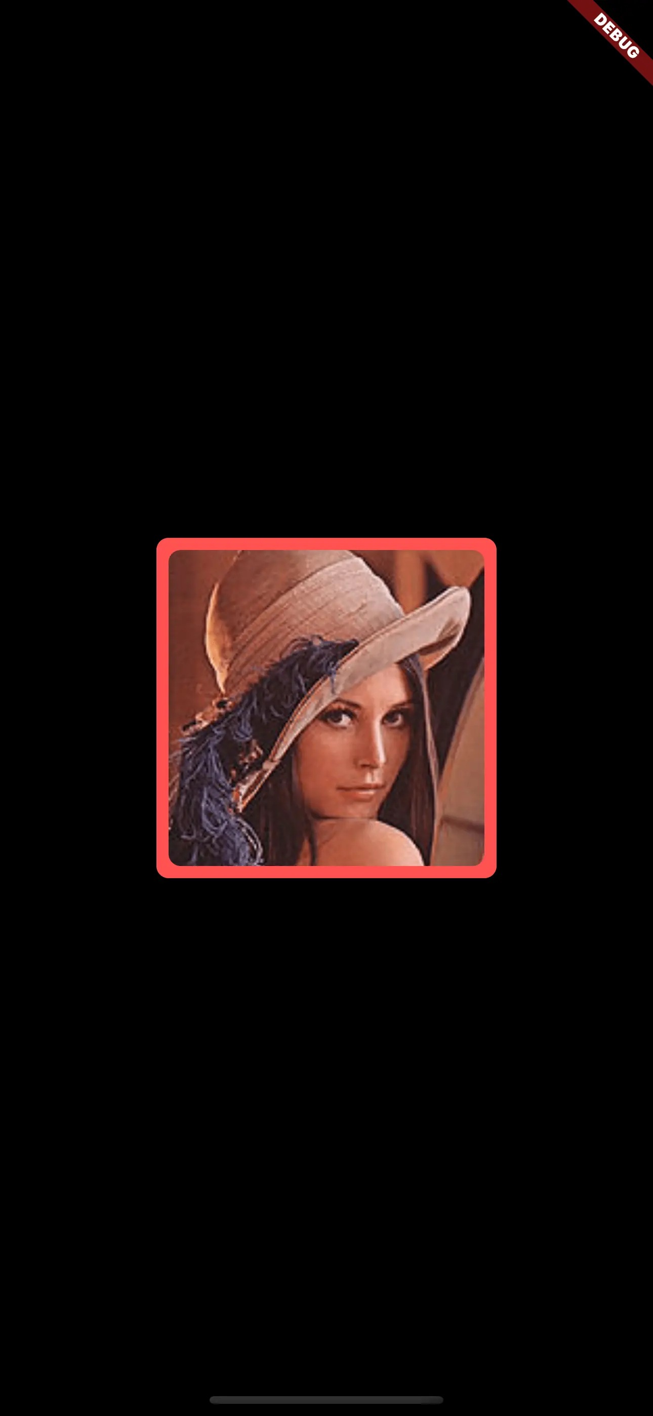
 1final borderRadius = BorderRadius.circular(20);
 2
 3Container(
 4  padding: EdgeInsets.all(8),
 5  decoration: BoxDecoration(color: Colors.red, borderRadius: borderRadius),
 6  child: ClipRRect(
 7    borderRadius: borderRadius,
 8    child: SizedBox.fromSize(
 9      size: Size.fromRadius(48),
10      child: Image.network('https://my.image.url', fit: BoxFit.cover),
11    ),
12  ),
13)
Image as a circle
When you want the image to be displayed as a circle like e. g. when displaying profile images, you have basically two easy-to-use options:
- Using a
ClipOval - Using a
CircleAvatar
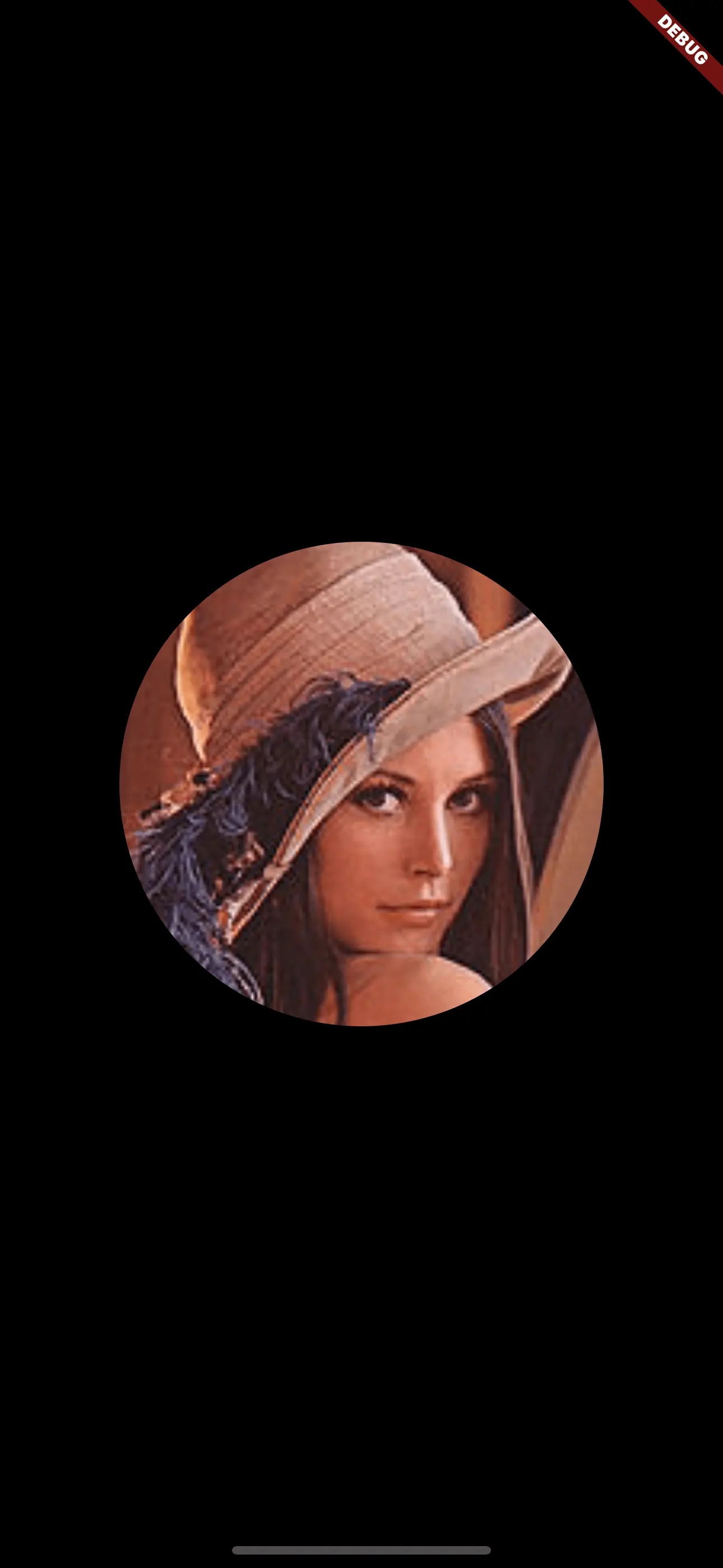
The ClipOval is just the equivalent of ClipRRect for circles. CircleAvatar is explicitly built for displaying profile images and has numerous options to support this whereas ClipOval has no opinion about what’s being rendered inside the child widget.
ClipOval
The usage of ClipOval is as simple as ClipRRect: most of the time, the only parameter you need to use is the child parameter, which expects a Widget that is being turned into a circle.
1ClipOval(
2  child: SizedBox.fromSize(
3    size: const Size.fromRadius(144),
4    child: Image.network(
5      'https://my.image.url',
6      fit: BoxFit.cover,
7    ),
8  ),
9)
CircleAvatar
With CircleAvatar, you can achieve the very same effect but have a few more options.
foregroundImage or the backgroundImage option. It doesn’t matter which one to use if you don’t plan to use a fallback image.
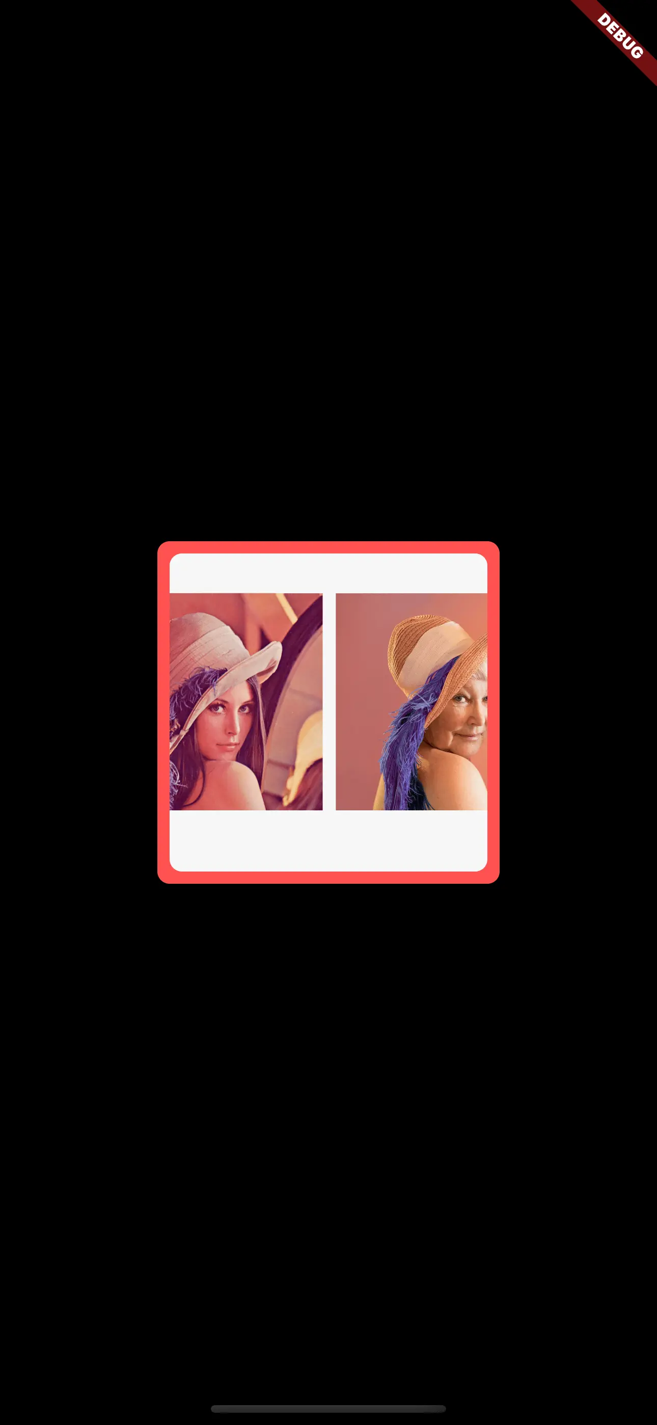
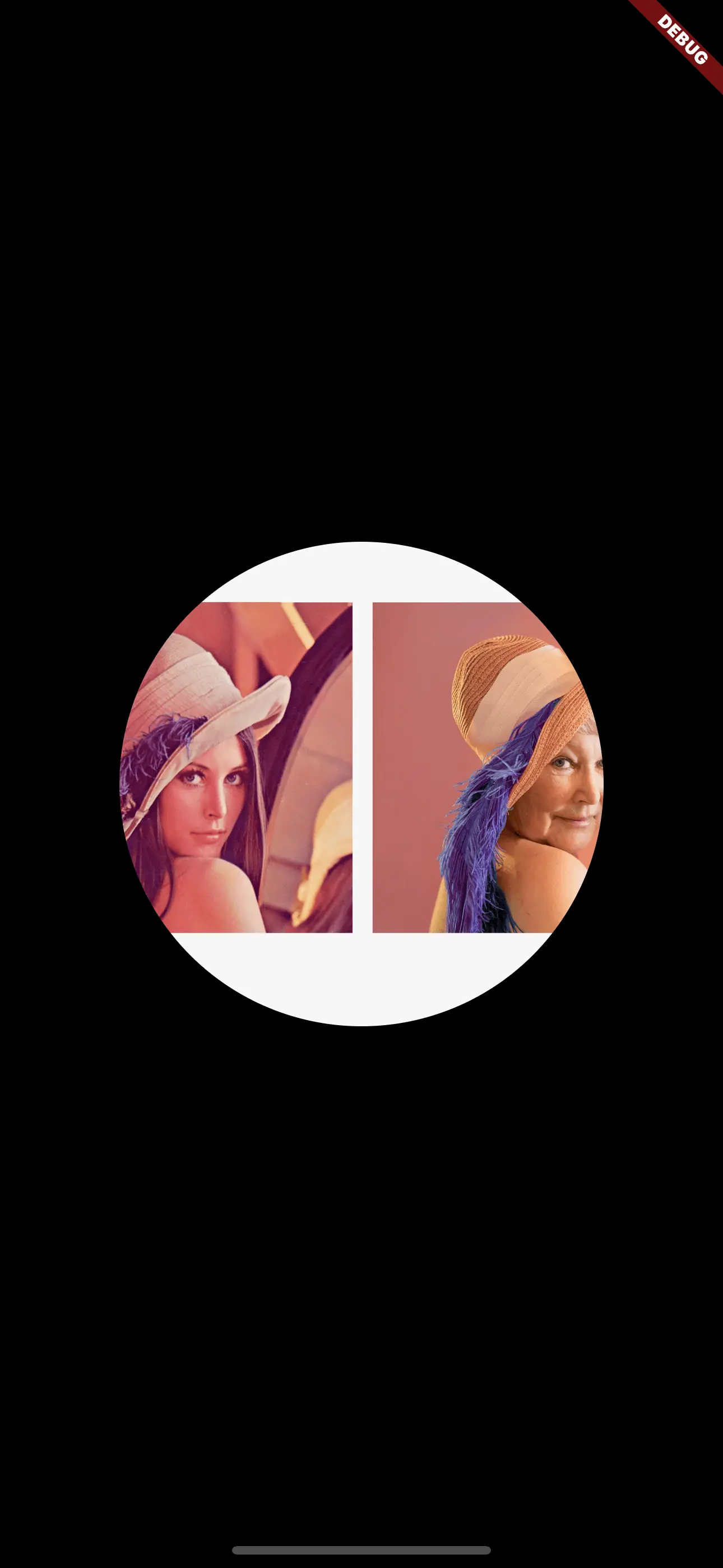
So in comparison to the Clip widgets, you should not use the child property for images. If you do so, the image won’t be clipped and look like this: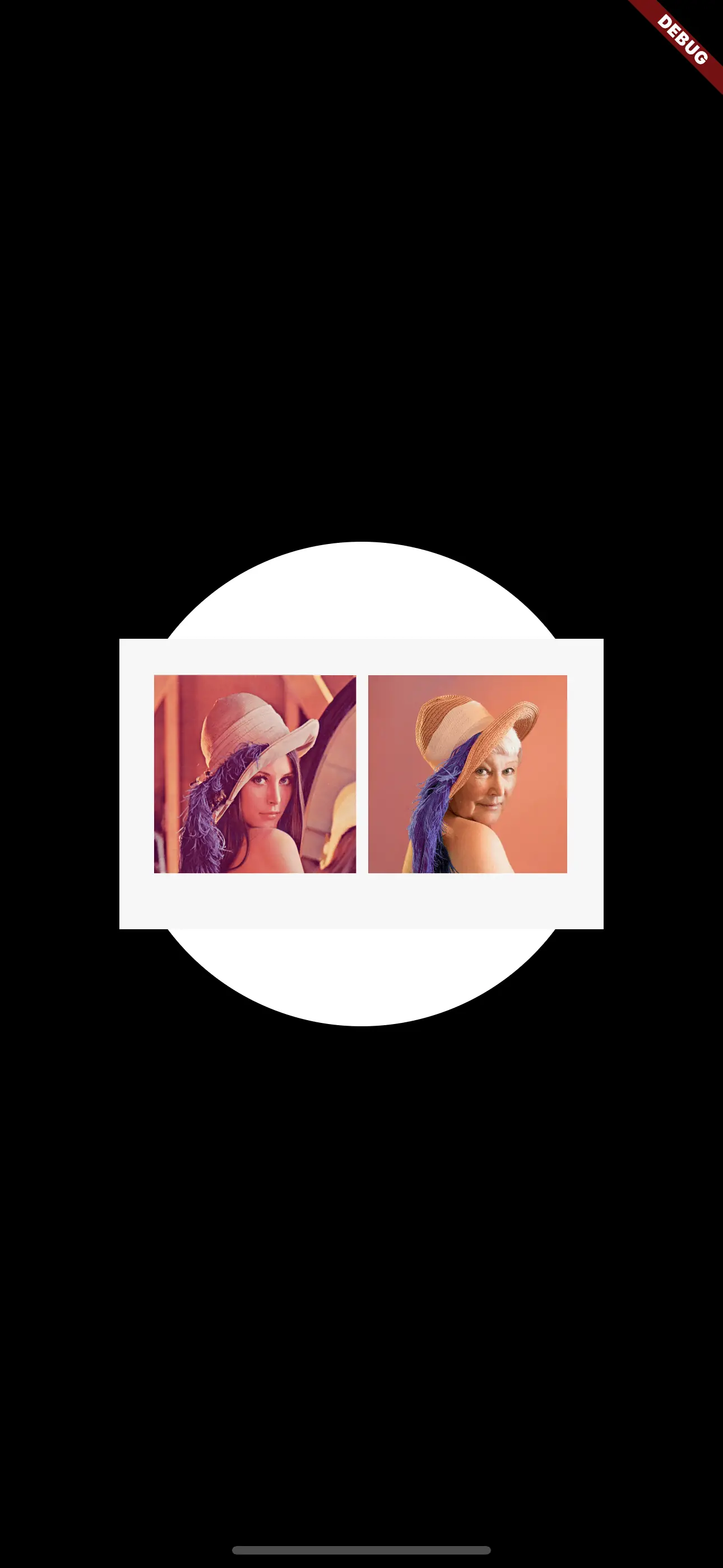
child property for images!If you use an image source that has a loading time before being displayed, the content will be displayed in the following ordered cascade:
foregroundImagechildbackgroundImage
Meaning that it will look for foregroundImage first. If it’s not there (or still loading), it will display child. Below this it will display backgroundImage if provided and loaded.
There’s also the backgroundColor property which defaults to the primary color of the defined theme.
So if you just want to display an image, you should use the foregroundImage property to point to your image and set the backgroundColor to Colors.transparent to prevent your primary color being shown while the image is being loaded:
1SizedBox.fromSize(
2  size: const Size.fromRadius(144),
3  child: CircleAvatar(
4    backgroundColor: Colors.transparent,
5    foregroundImage: Image.network(
6      'https://my.image.url',
7    ).image,
8  ),
9)
If you want to have a textual fallback for your image (such as the user’s initials), you can use the child property to define this fallback like this:
 1SizedBox.fromSize(
 2  size: const Size.fromRadius(144),
 3  child: CircleAvatar(
 4    backgroundColor: Colors.red,
 5    foregroundImage: Image.network(
 6      'https://my.image.url',
 7    ).image,
 8    child: const Text('XX', style: TextStyle(fontSize: 32)),
 9  ),
10)
Conclusion
Flutter comes up with a decent utility to display any image with rounded corners: it’s called Clip. A Clip widget renders only parts of the widget you provide. With the predefined Clip widgets ClipRect and ClipOval, you can easily show an image with rounded corners or as a circle.
For circles, you also have the option to use the CircleAvatar widget. It allows you to defined fallbacks to be display if the loading of the image fails or is still pending.
It depends on the desired effect, which widget is suitable for your needs. Clip is a more generic solution whereas CircleAvatar aims - as the name suggests - for use cases in which an avatar (user’s image or initials) are displayed.


Comment this 🤌